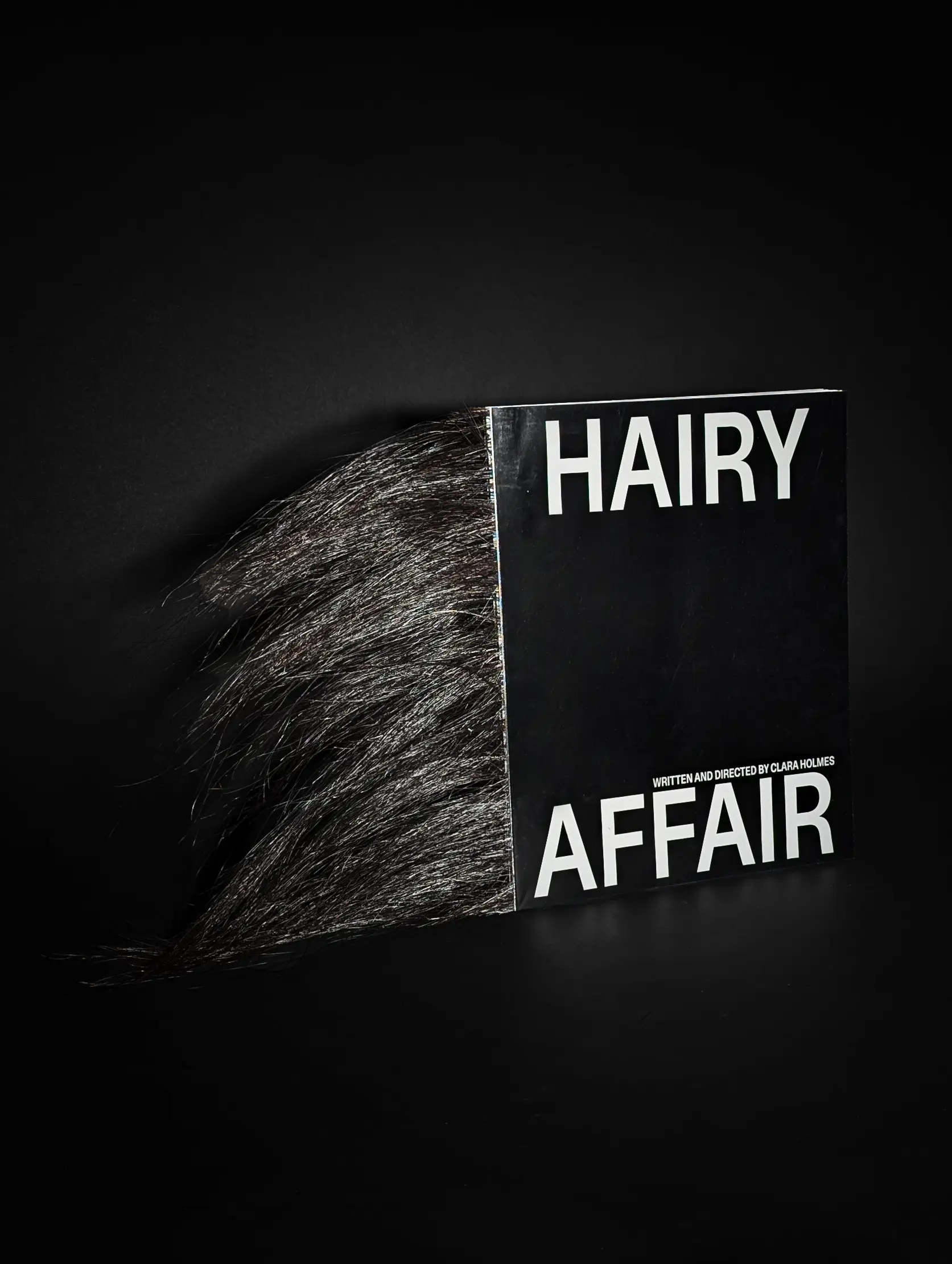
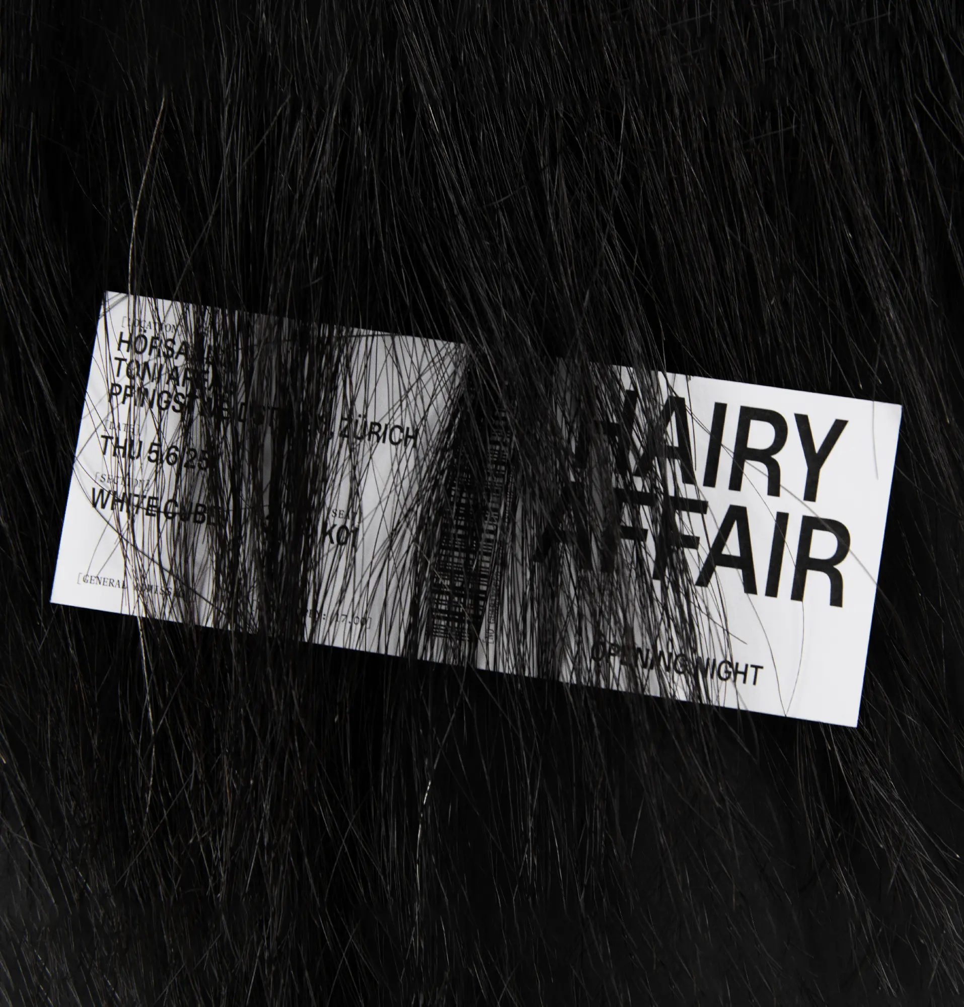
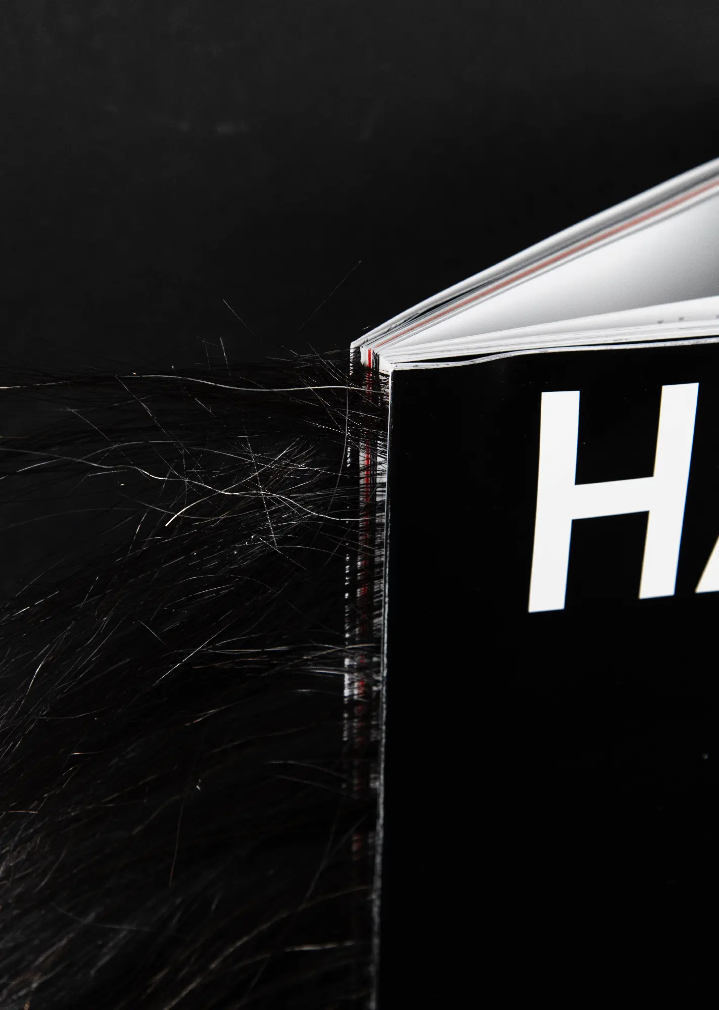
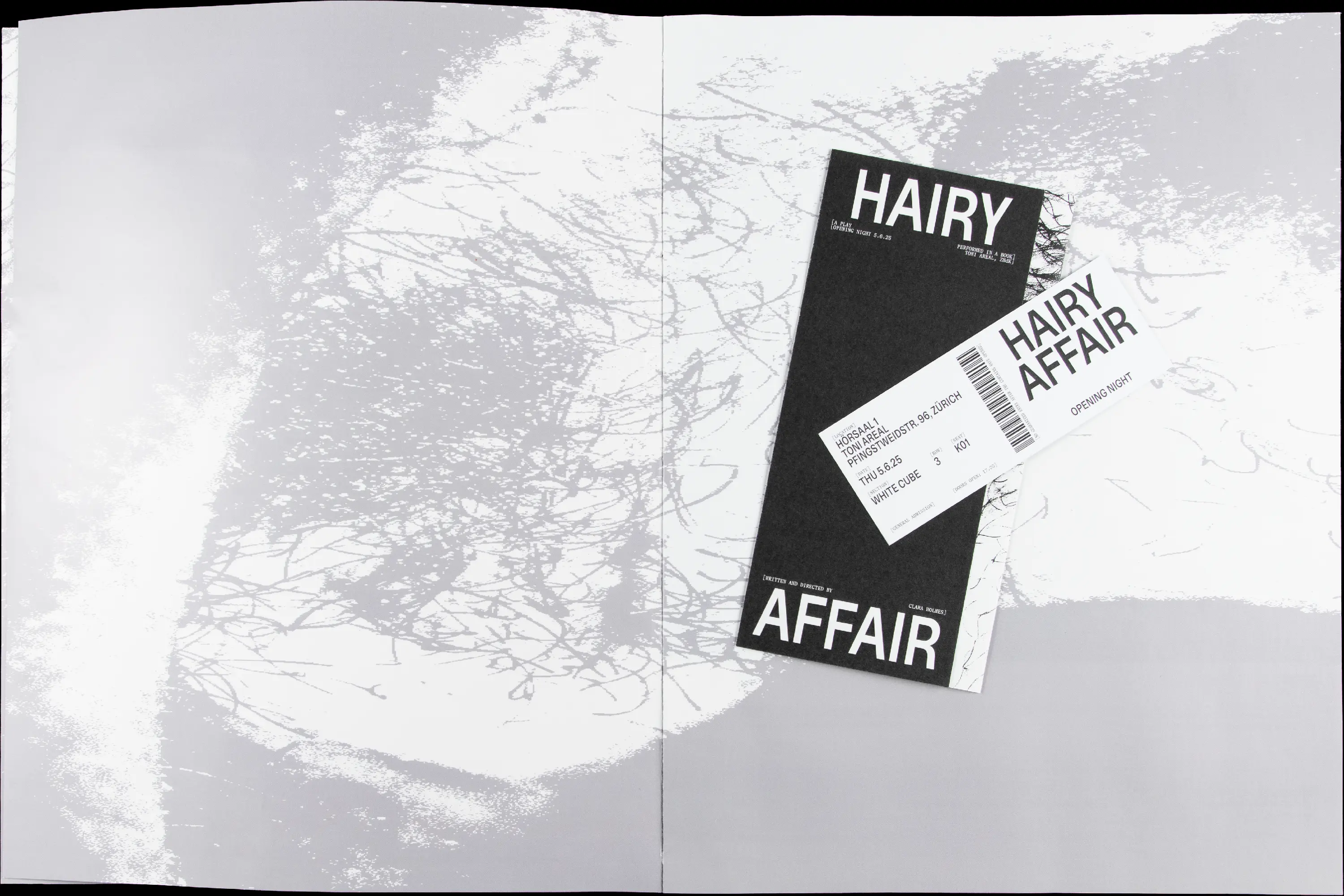
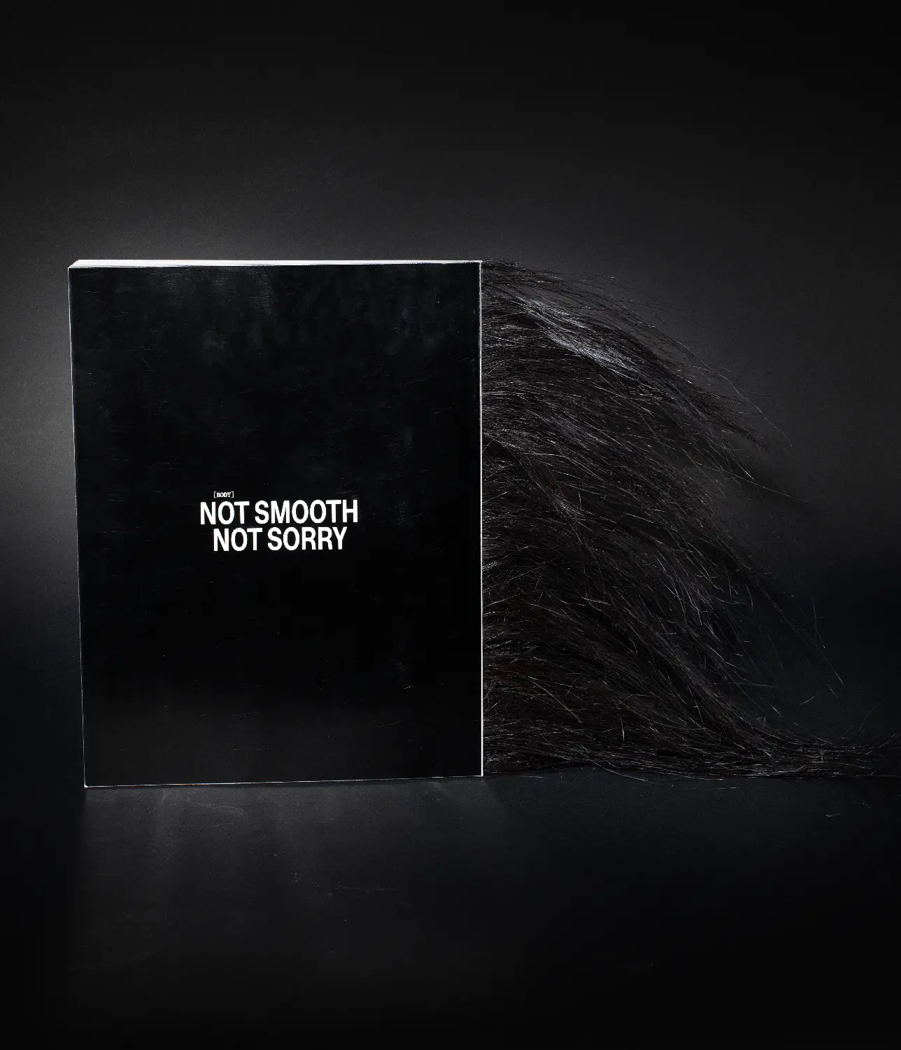
Hairy Affair
Editorial
280×365mm
144p.
144p.
June 2025
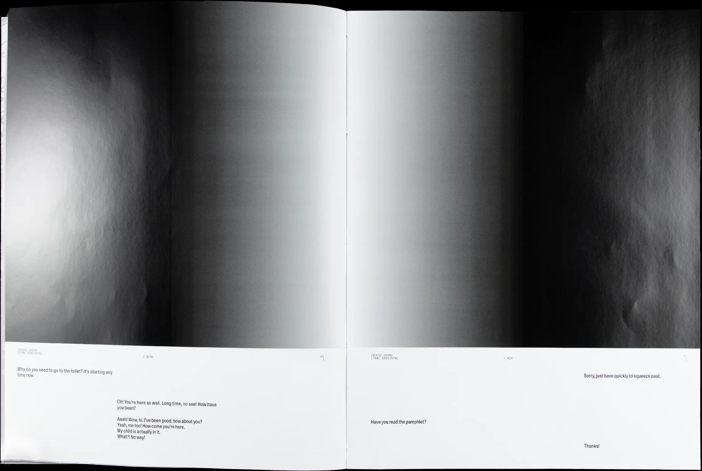
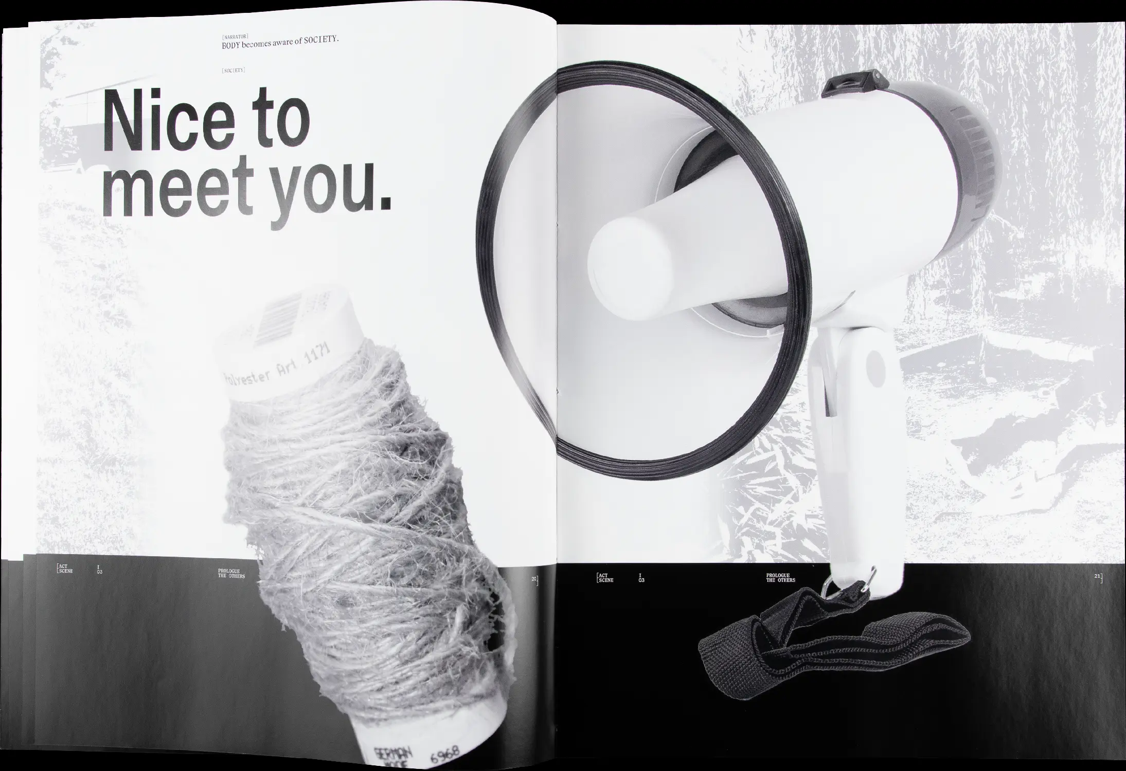
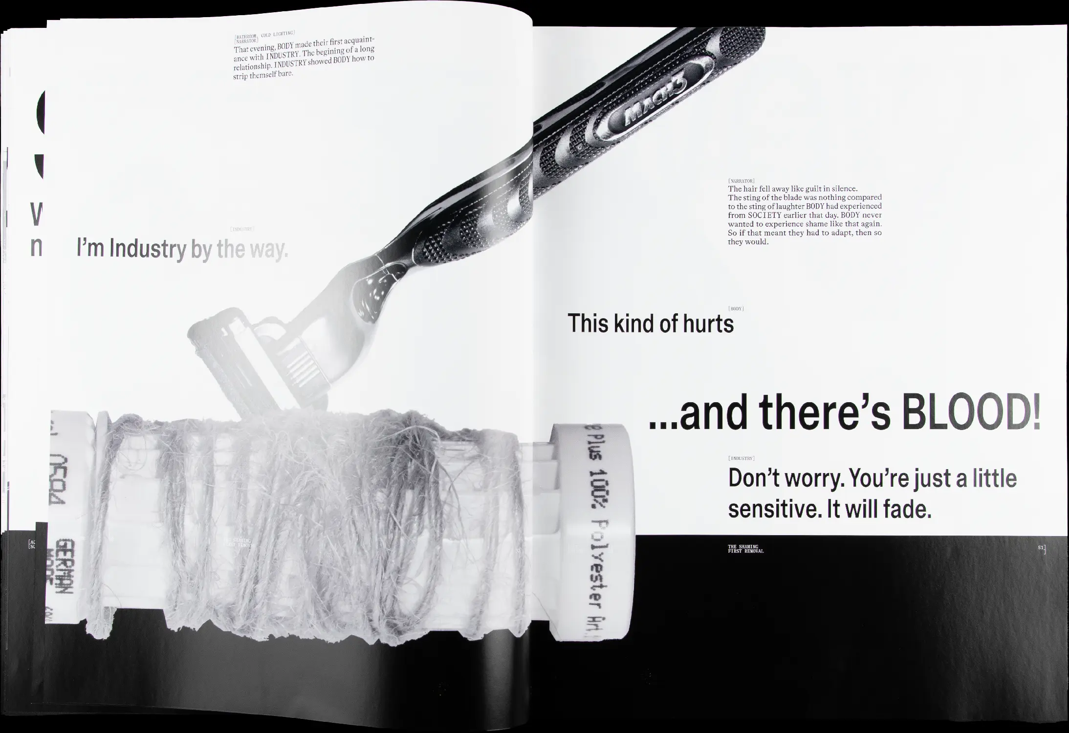
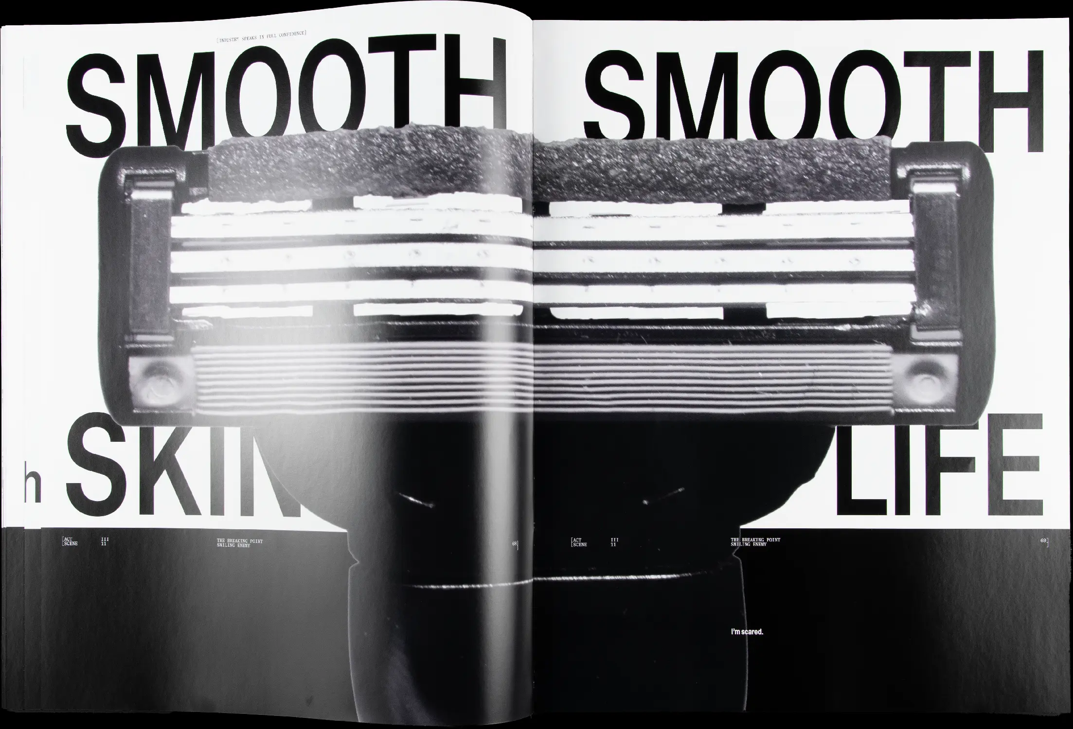
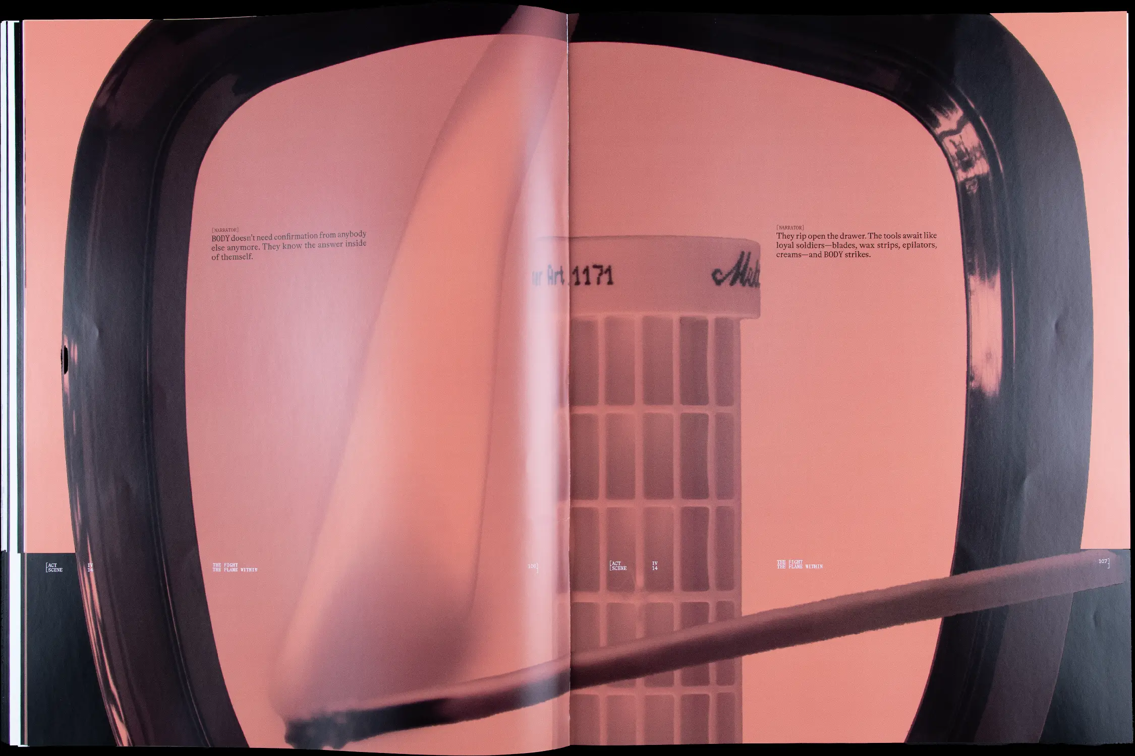
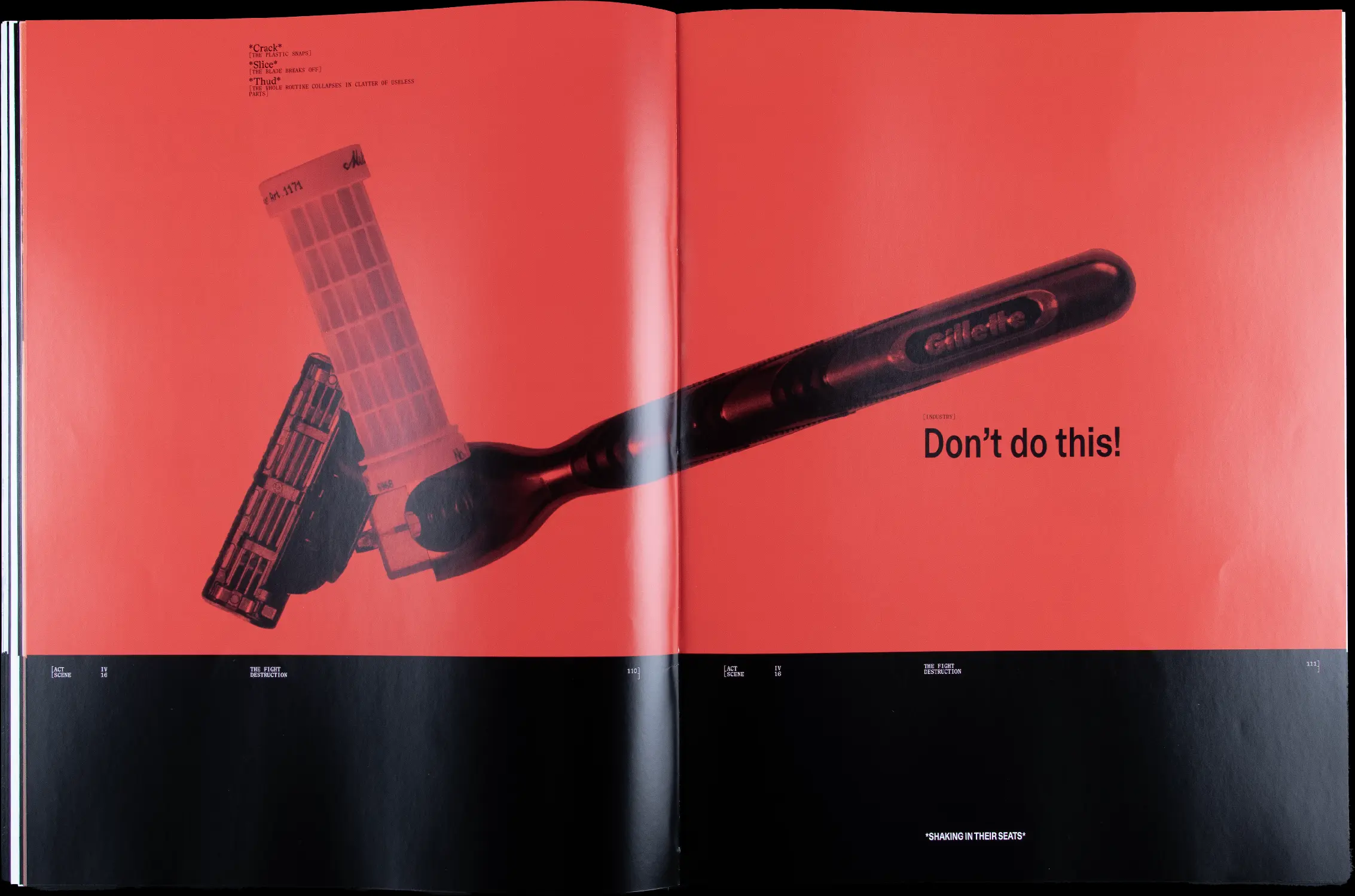
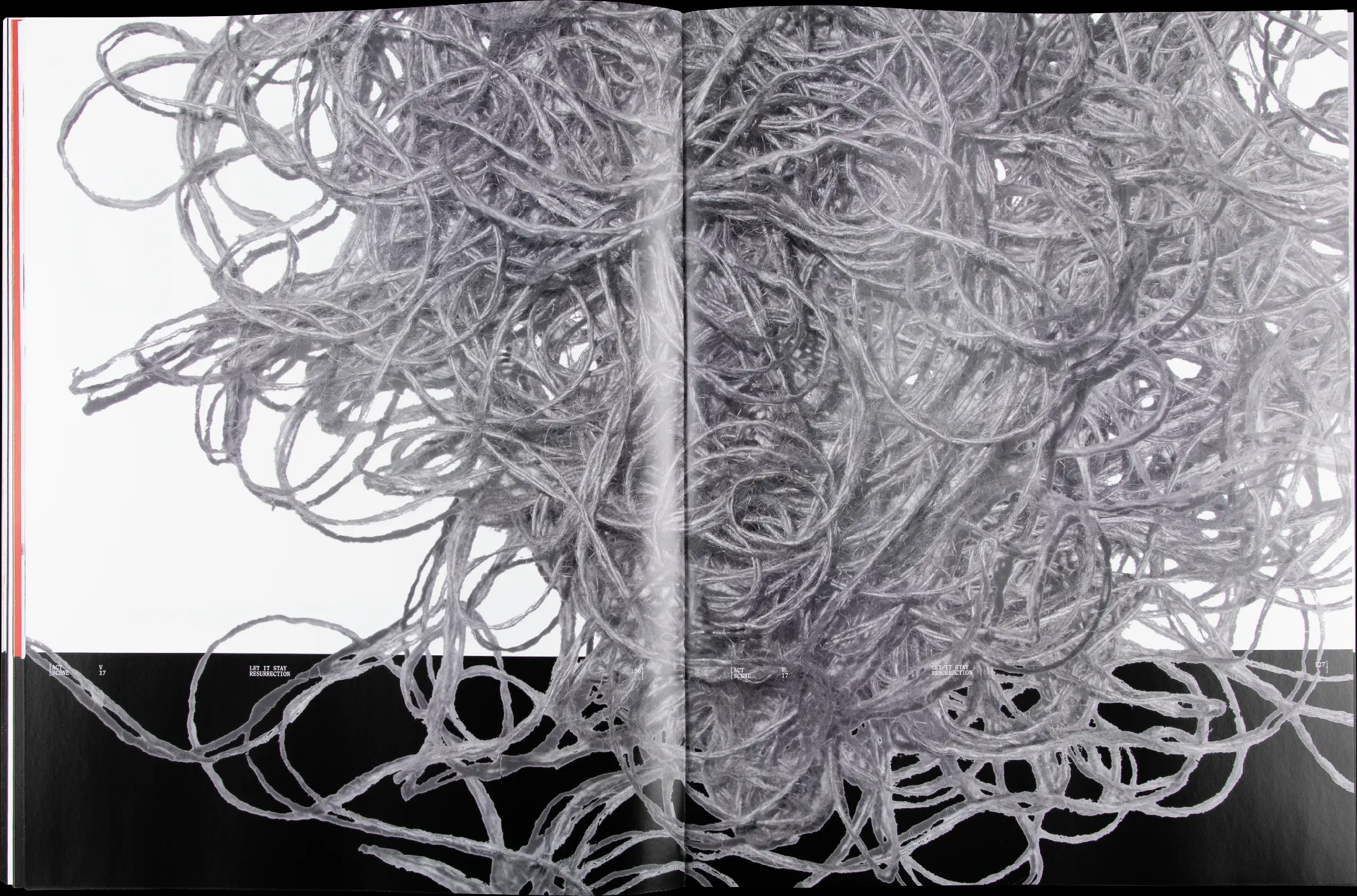
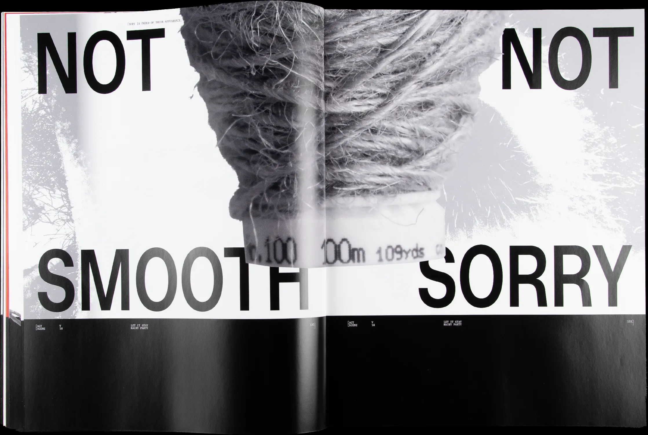
Body hair grows soft, wild, and everywhere, defining our human identity.
However it attracts attention, triggers emotions, and is often shaped by expectations to be tamed.
Celebrating it suddenly becomes an act of resistance, a refusal to conform to imposed beauty
standards. Each hair becomes a quiet protest—against shame, silence, and invisibility.
My bachelor’s project tells the story of a body growing up, navigating outer influences
and inner conflict around body hair. It takes the form of a theatrical editorial,
honoring the body in its natural state and challenging conventional ideas of beauty and acceptance.
It reclaims visual communication as a space for self-determined identity.

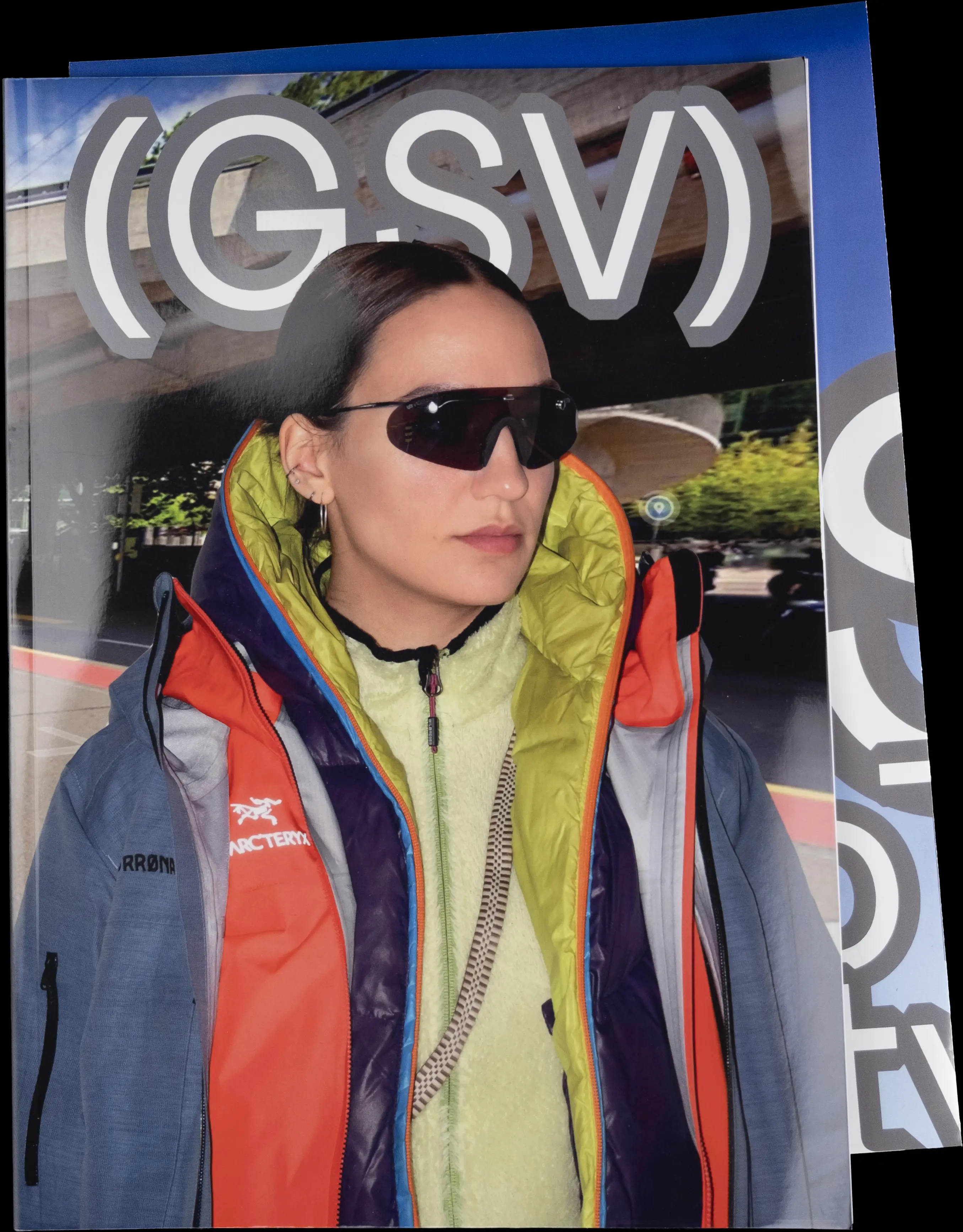
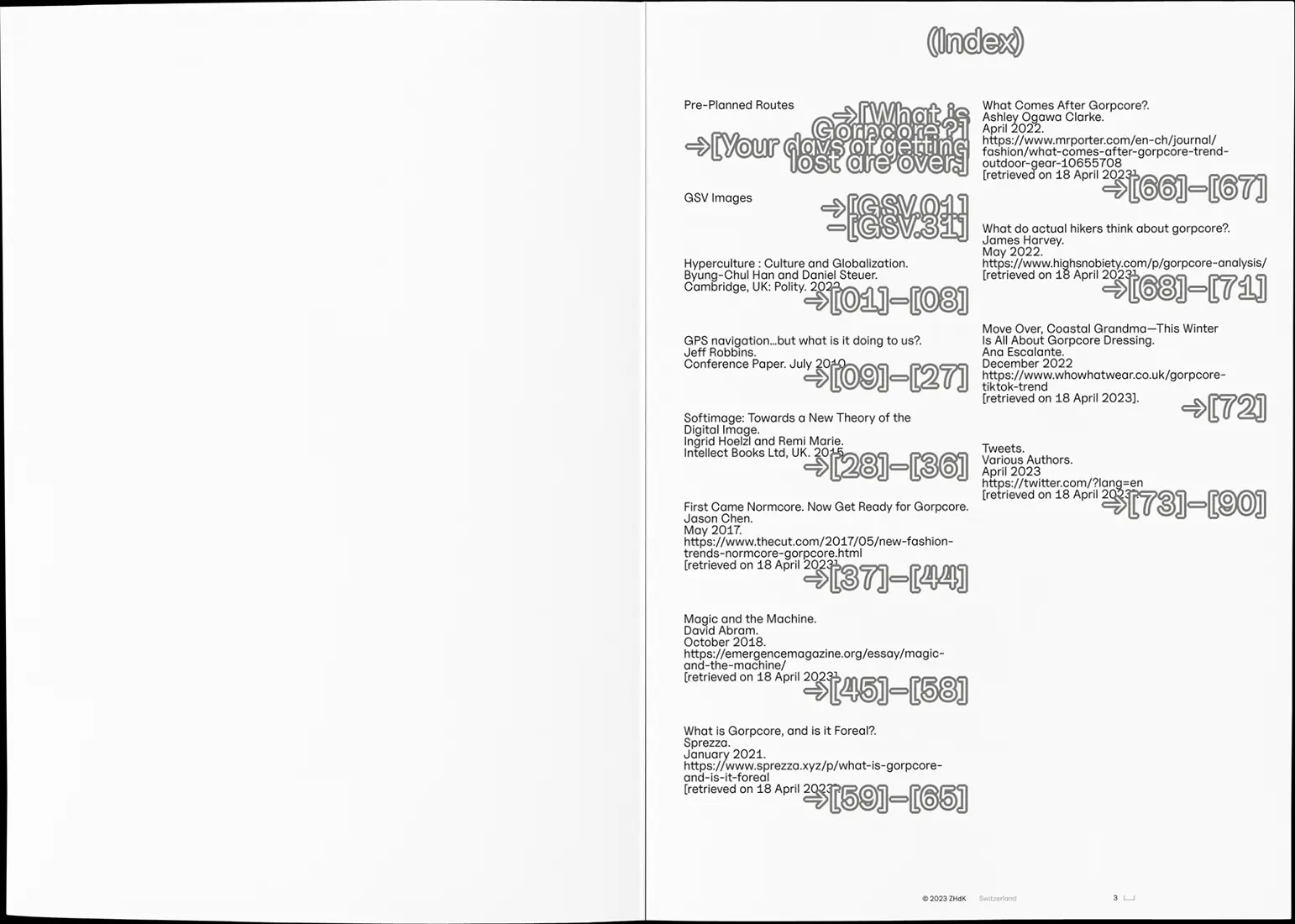
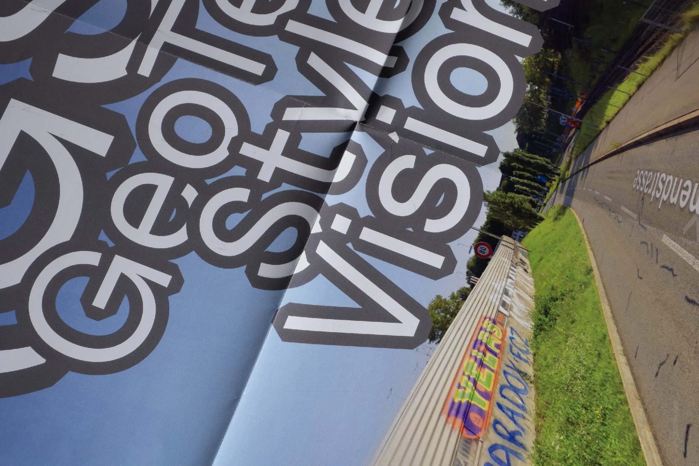
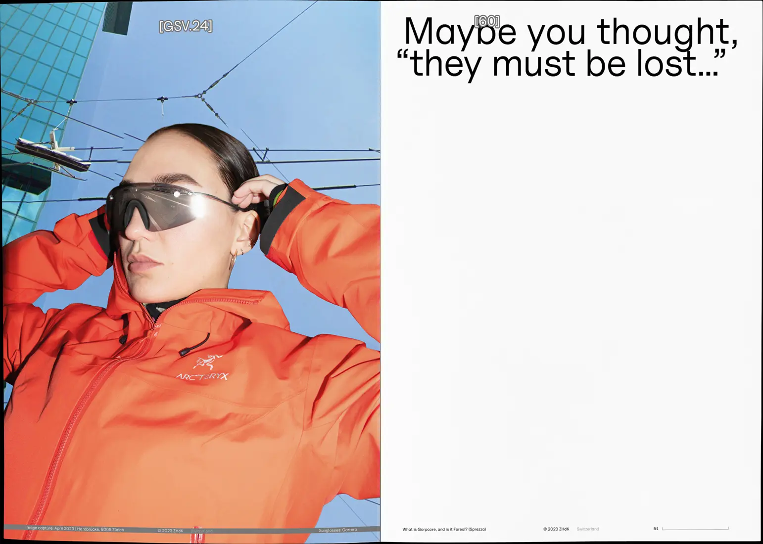
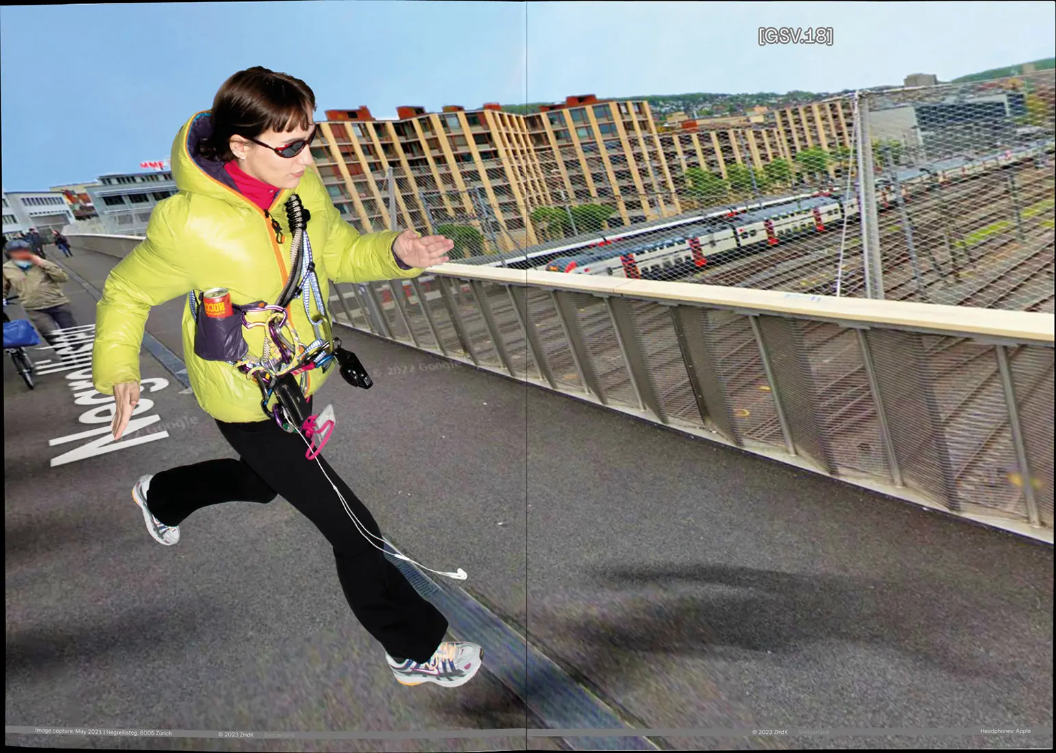
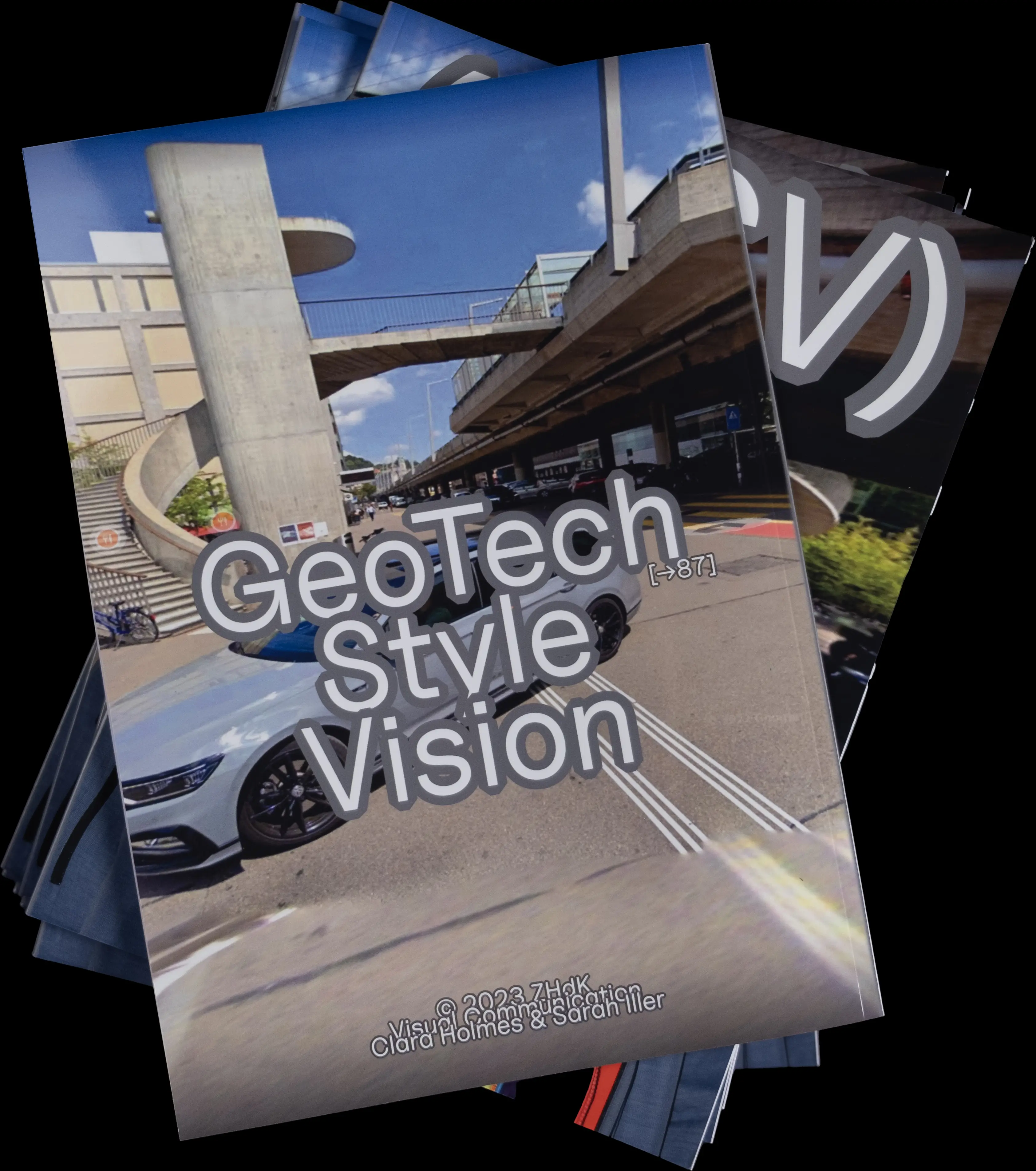
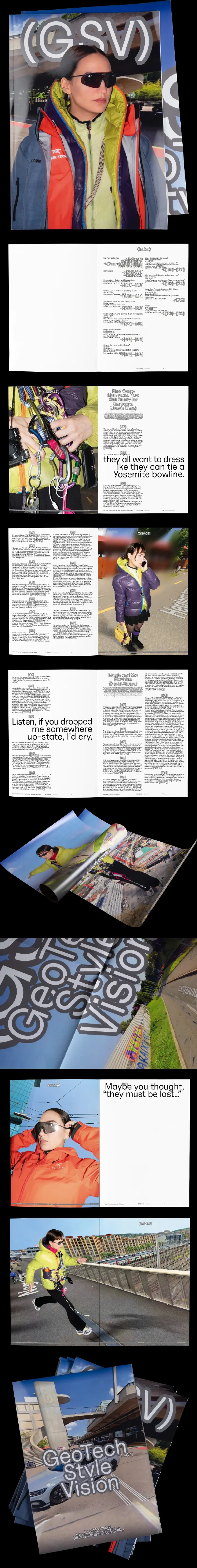
GeoTech Style Vision
Editorial
Poster
Photography
Poster
Photography
A4
68p.
68p.
April 2023
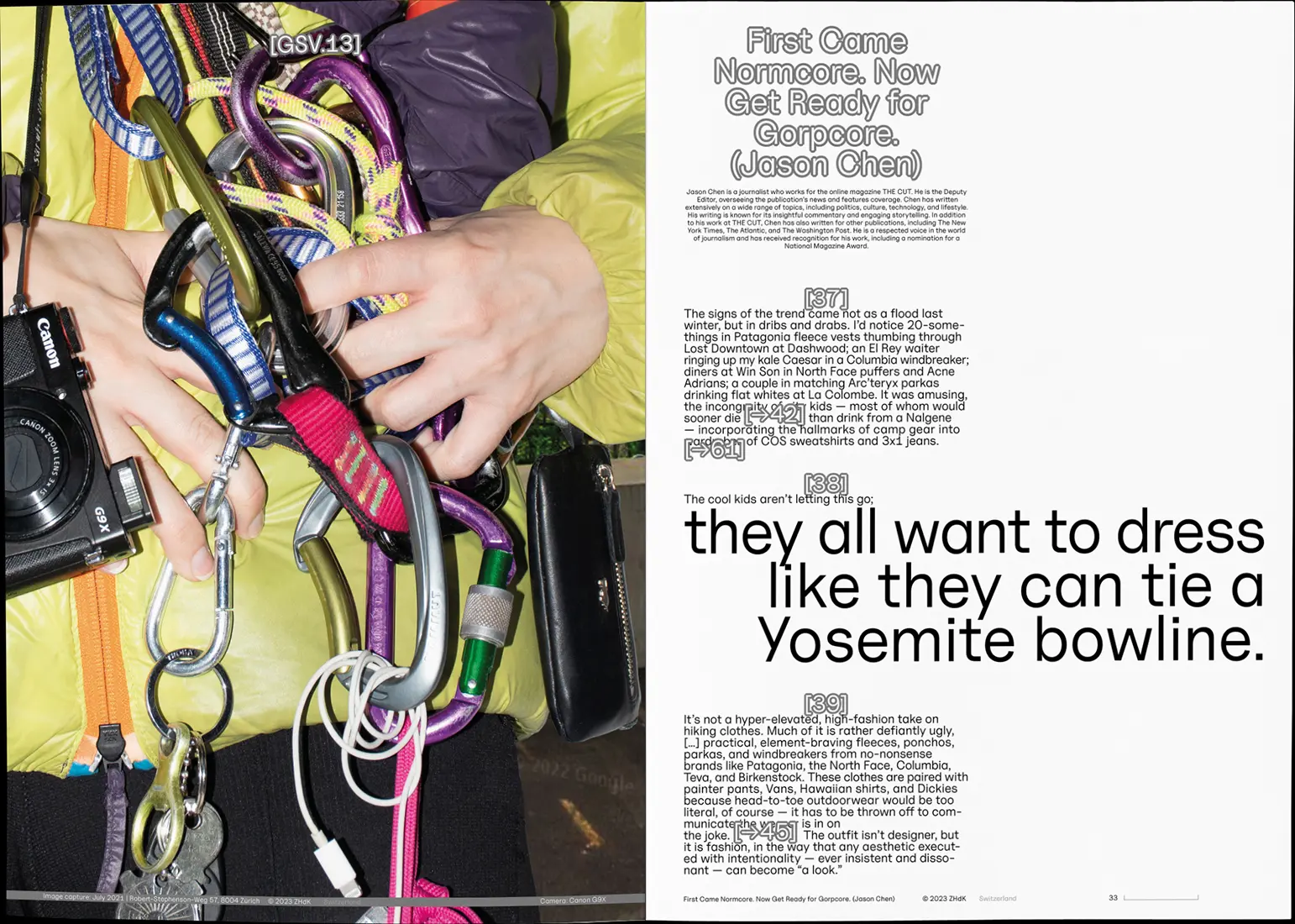
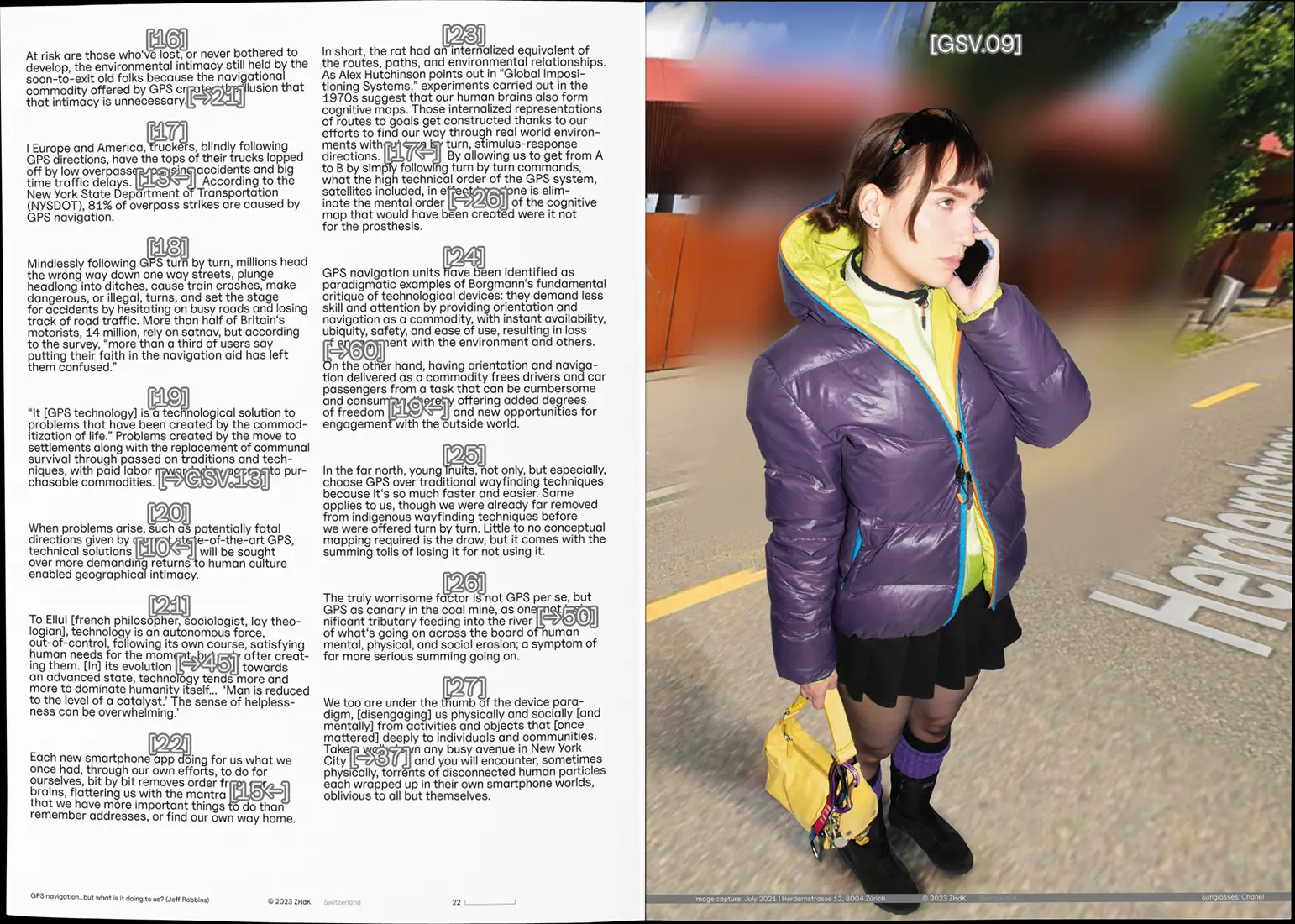
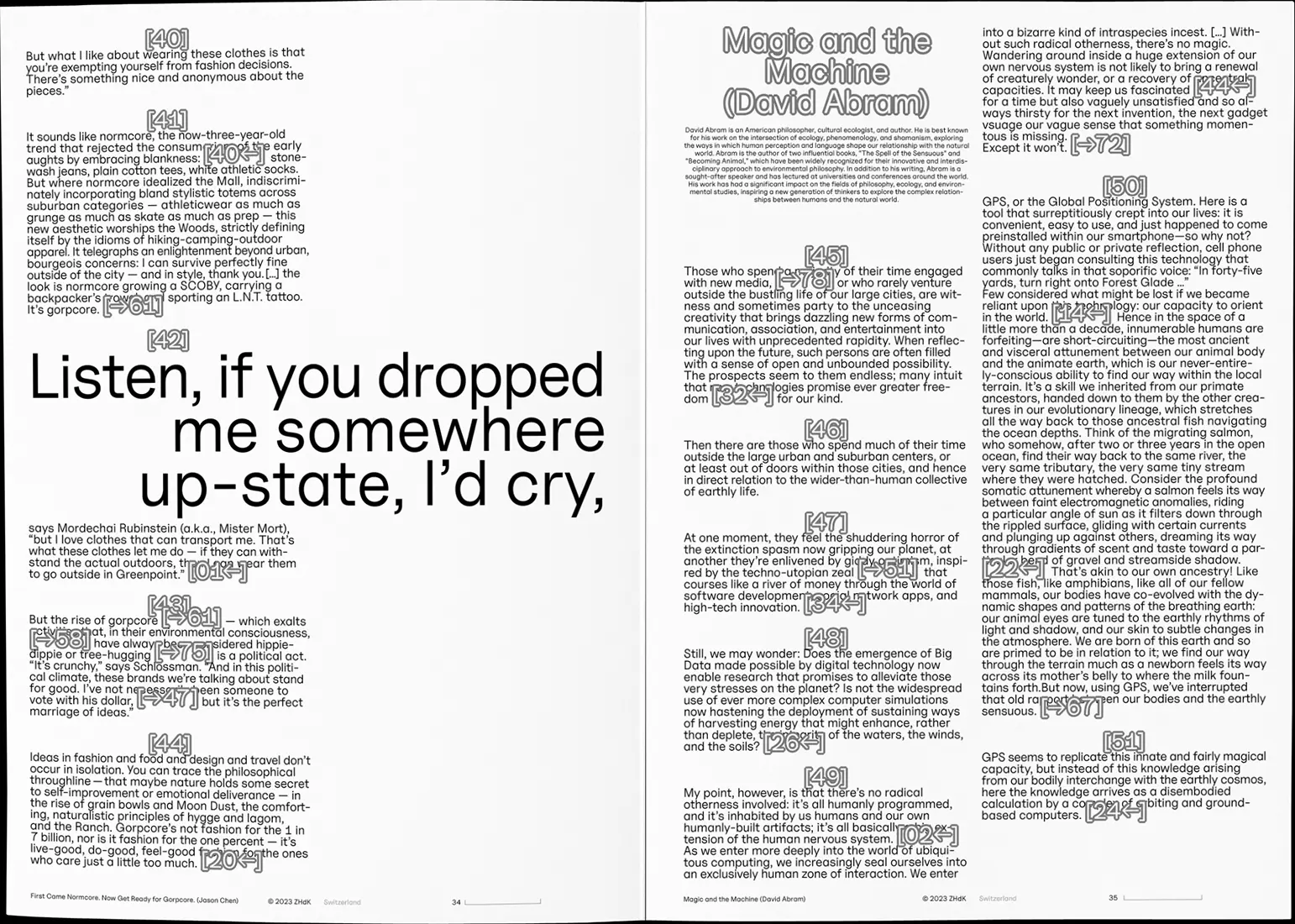
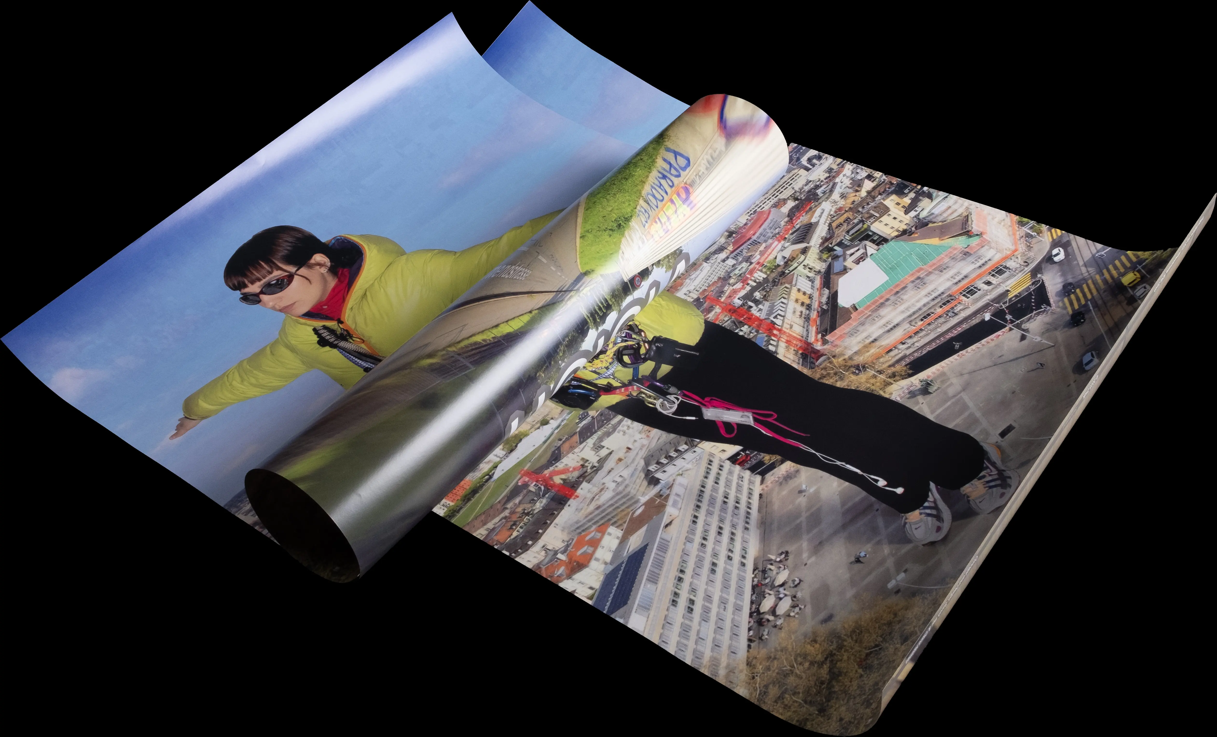
As technology like Google Street View makes exploring the world effortless, traditional
navigational skills fade away. A deeper engagement with the terrain is no longer needed, as satellite-based navigation
takes over for us. Meanwhile, urban fashion embraces technical outdoor gear designed for harsh conditions but worn
in the city, often just for trips to brunch—known as Gorpcore. GeoTech Style Vision [GSV], an editorial created with
↗ Sarah Iller, investigates these shifts and reveals their surprising links. Through hyperlinked texts, one can jump
from philosophical essays to tweets. The accompanying images in the editorial and poster blend Street View aesthetics with Gorpcore.
Featured in ↗ Hochparterre.

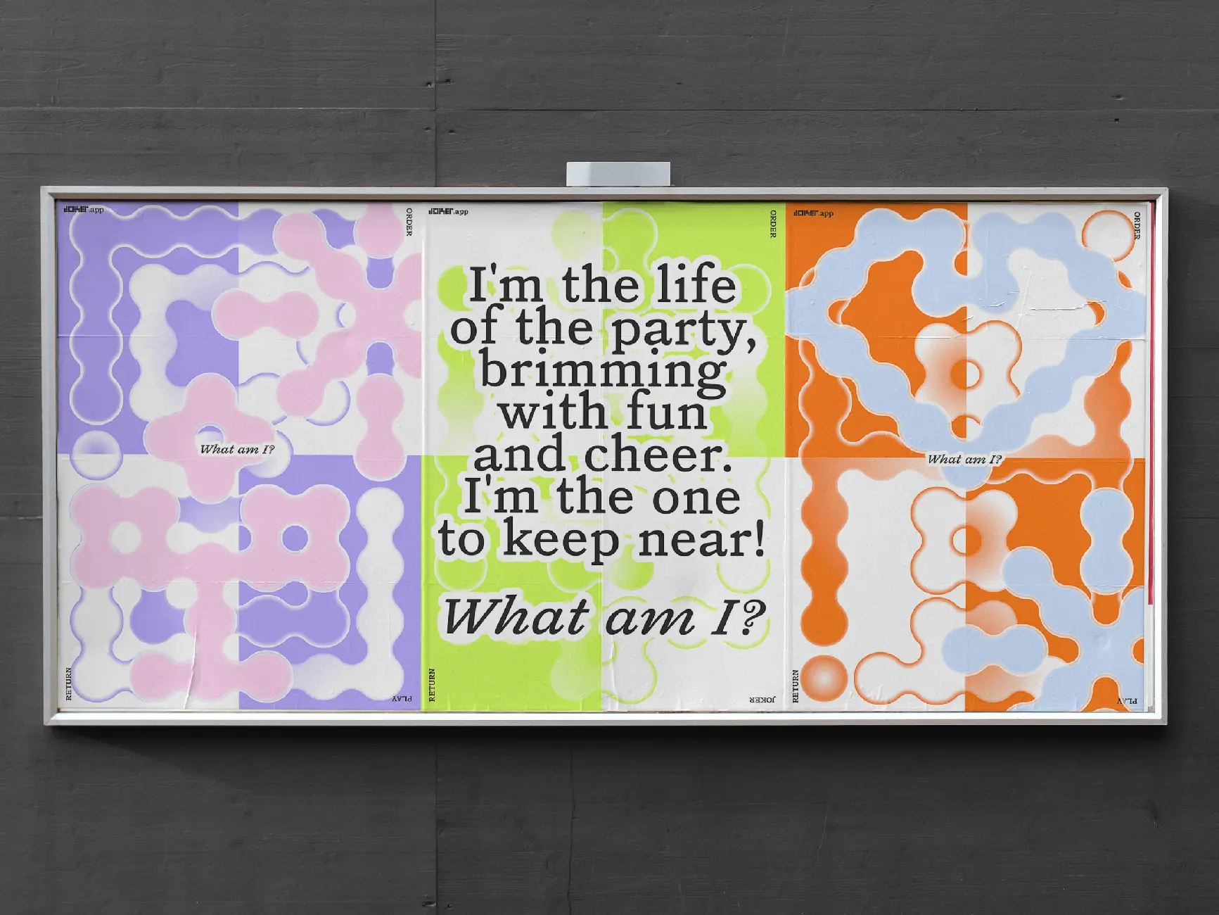
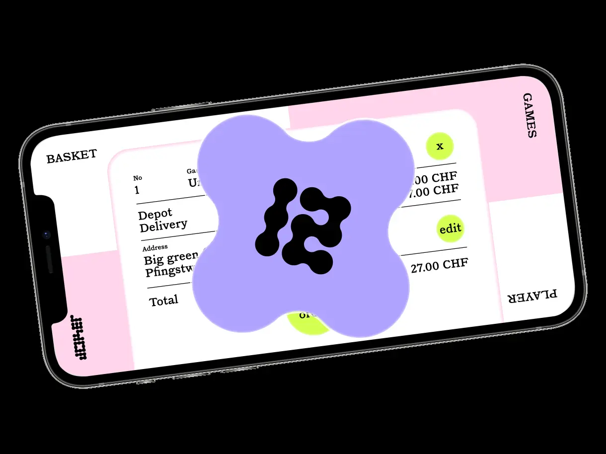
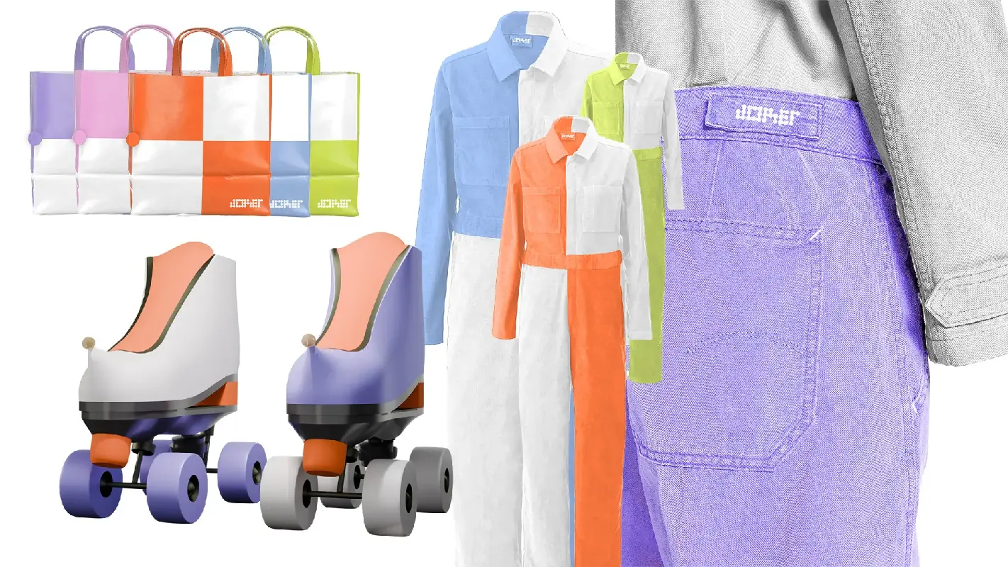
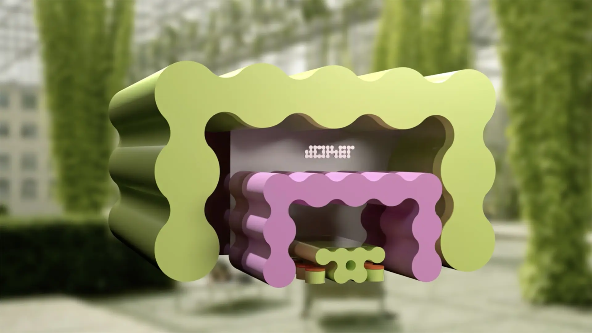
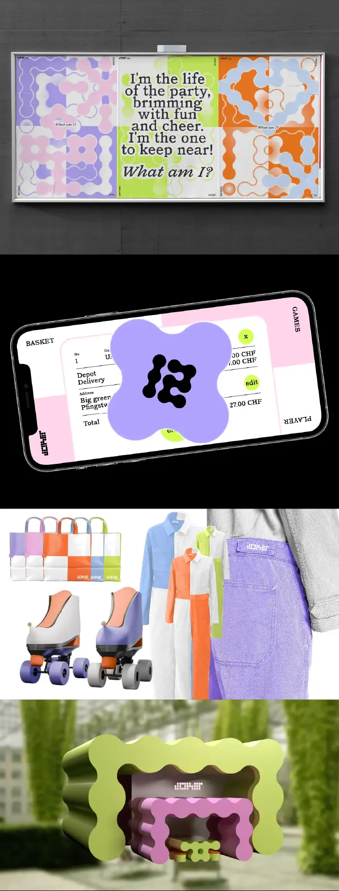
Joker
Branding
2'30''
October 2024
I'm the life of the party, brimming with fun and cheer, I'm the one to keep near. What
am I? Joker is a fictional delivery service, developed collaboratively with ↗ Ylenia Freiermuth,
↗ Cheyenne Cattaneo, ↗ Alison Léger and ↗ Marina Huber, that
brings games straight to you. With the motto order, play, return, the brand is built around social connection,
playfulness, and collaboration. All communication happens through riddles, drawing users into the experience
from the start. The mobile interface responds to physical movement: turning the phone reveals different functions,
from browsing the game deck to checking out. Visual elements throughout the identity subtly reference familiar
aspects of games.
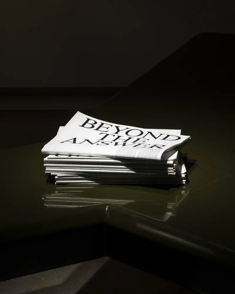
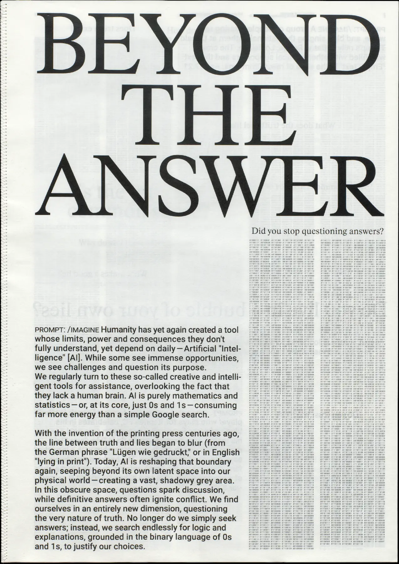
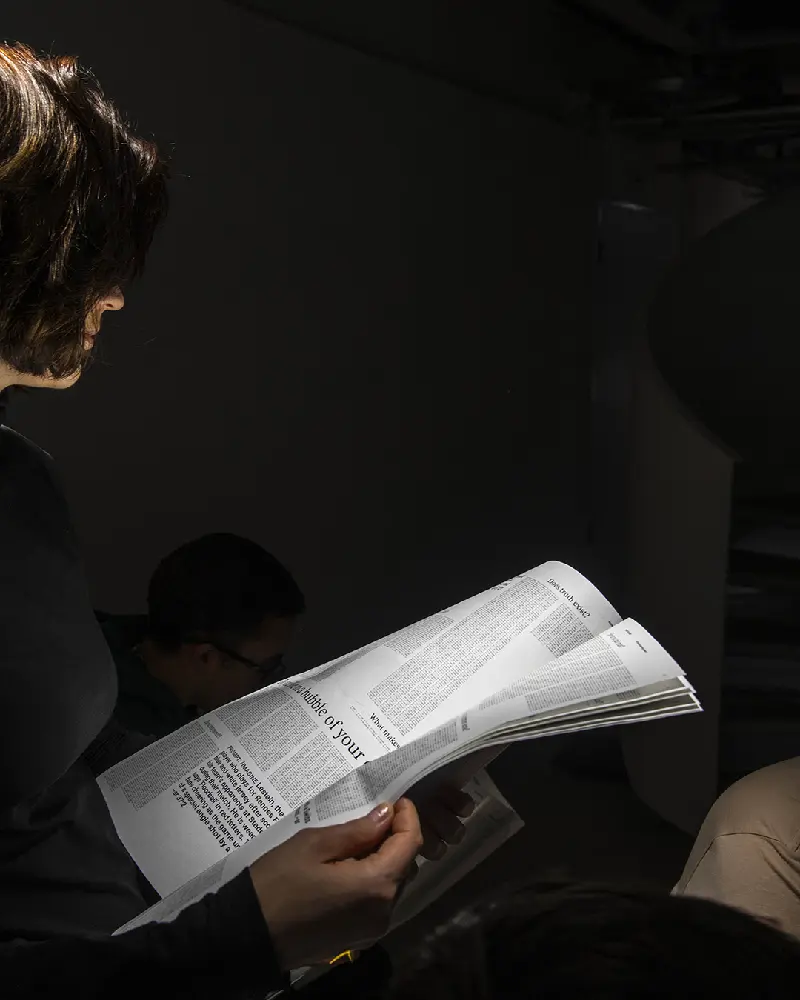
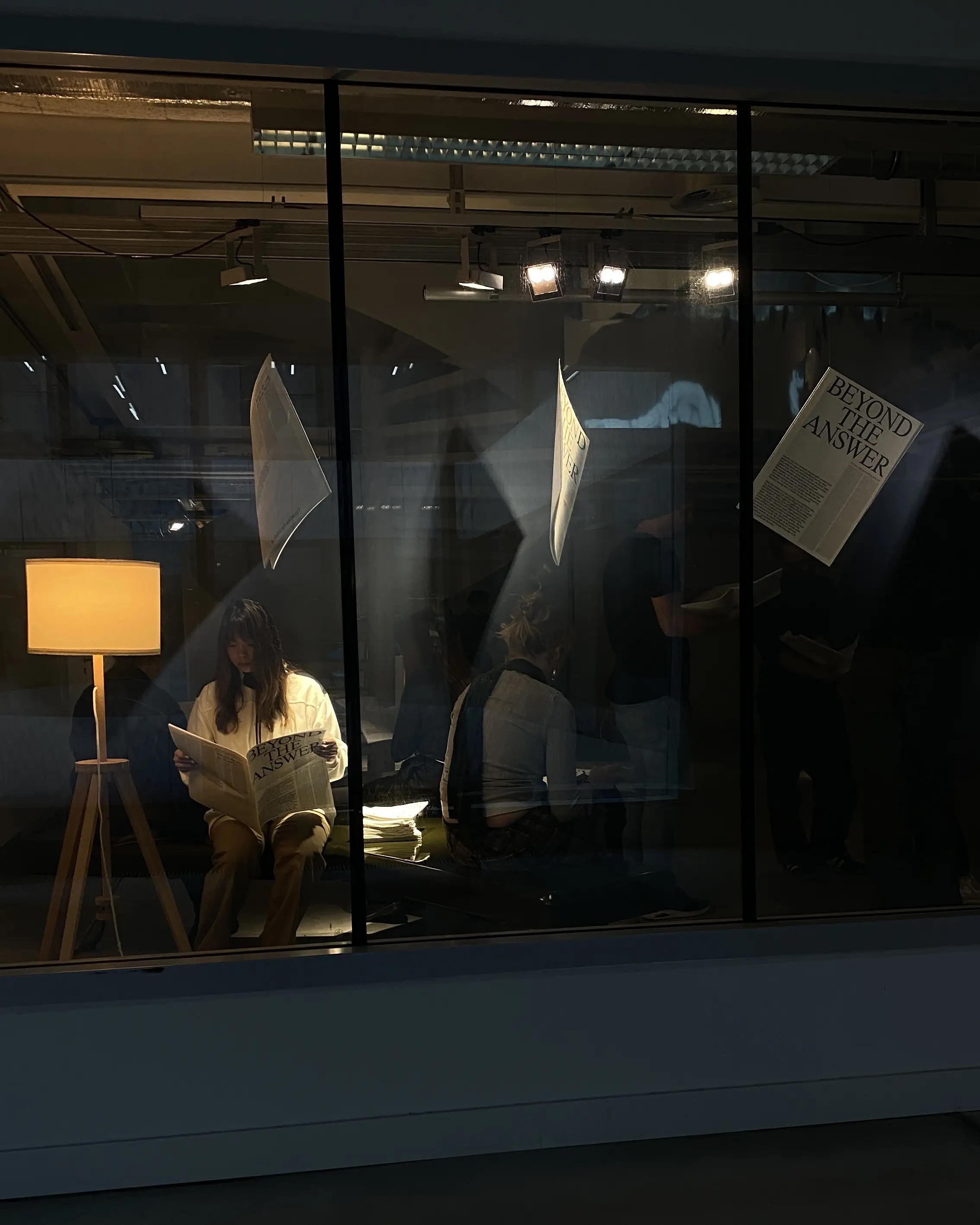
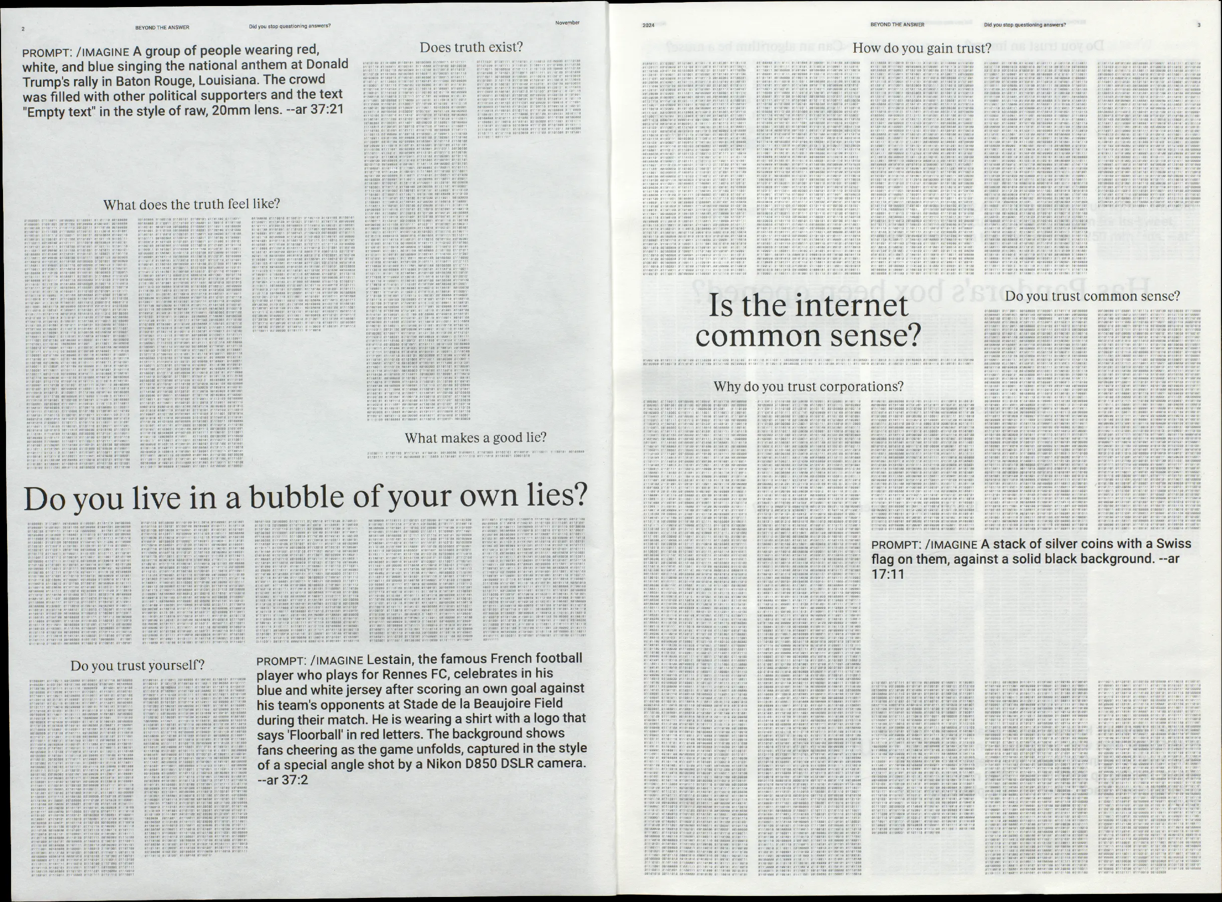
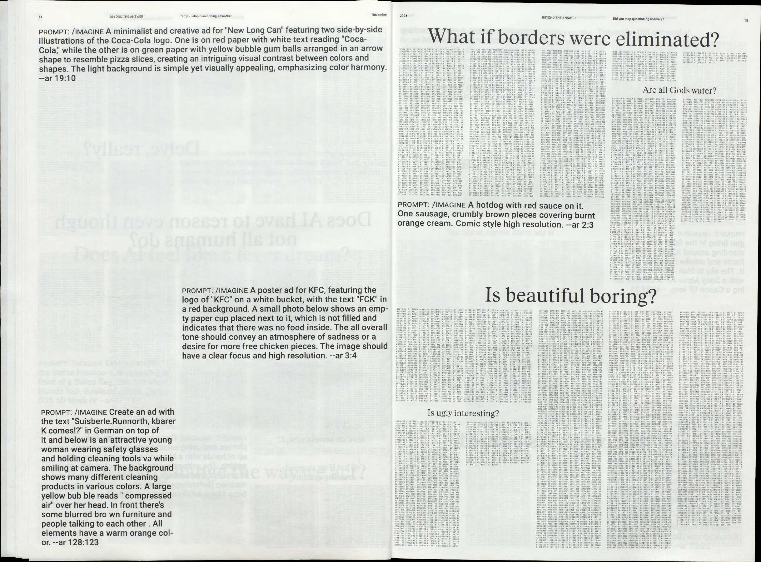
Beyond the Answer
Editorial
A3
20p.
20p.
November 2024
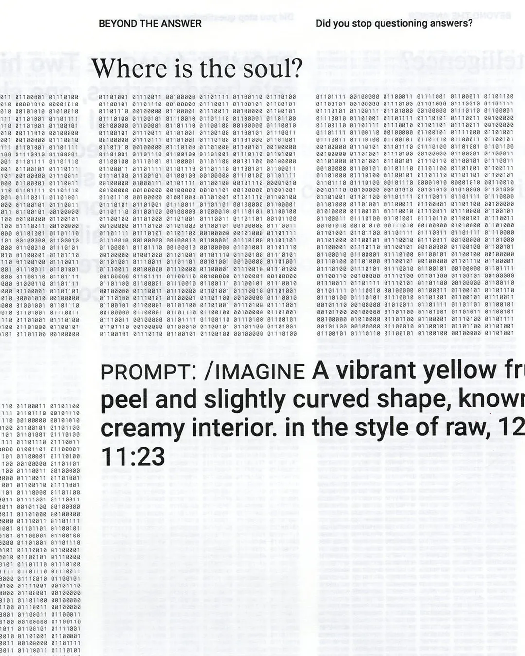
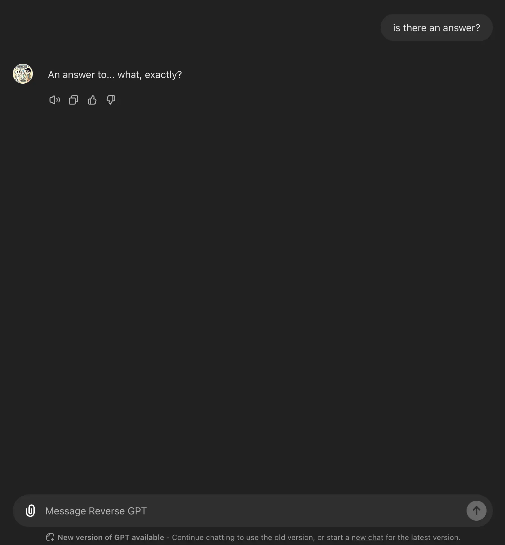
Artificial "Intelligence": A tool of infinite potential and uncertain consequences. We no
longer look for simple answers. Instead, we chase logic and explanations in its binary language to justify our
choices. In collaboration with ↗ Ylenia
Freiermuth and ↗ Medea Laim, we created a newspaper
that critically reflects
AI. The project is built around questions posed to AI, with responses translated back into 0 and 1’s. Instead of
images, it features AI generated prompts. The project asks how we deal with a system that knows
neither consciousness nor truth, but increasingly shapes our reality.

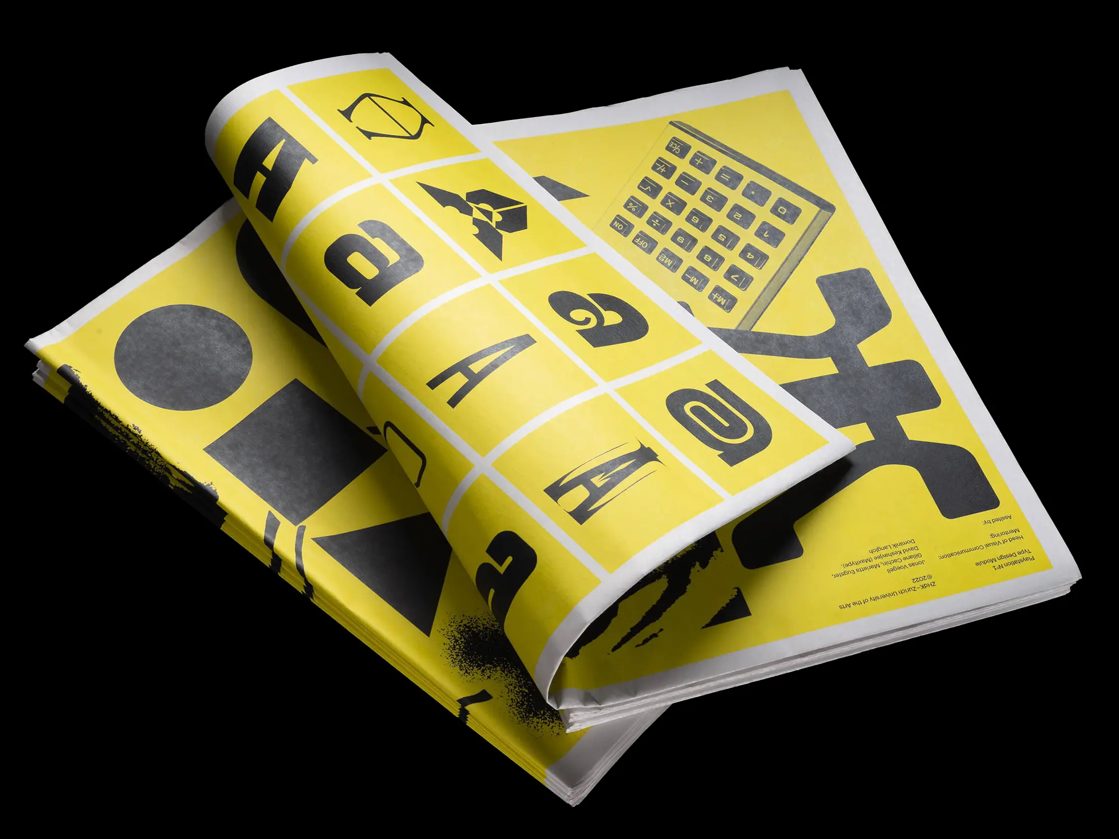
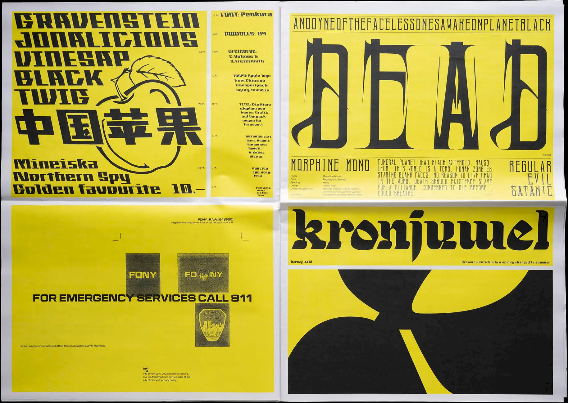
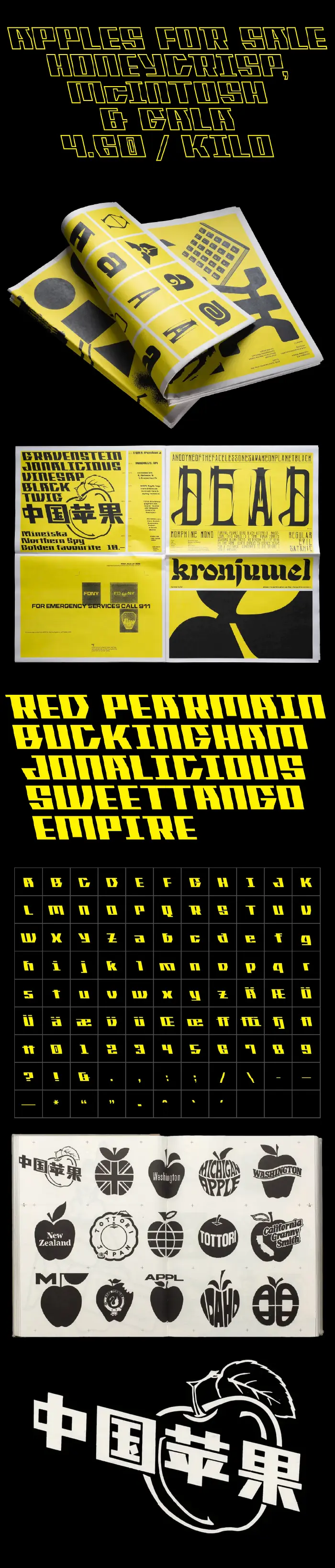
Pekura
Typedesign
1000 units
May 2022
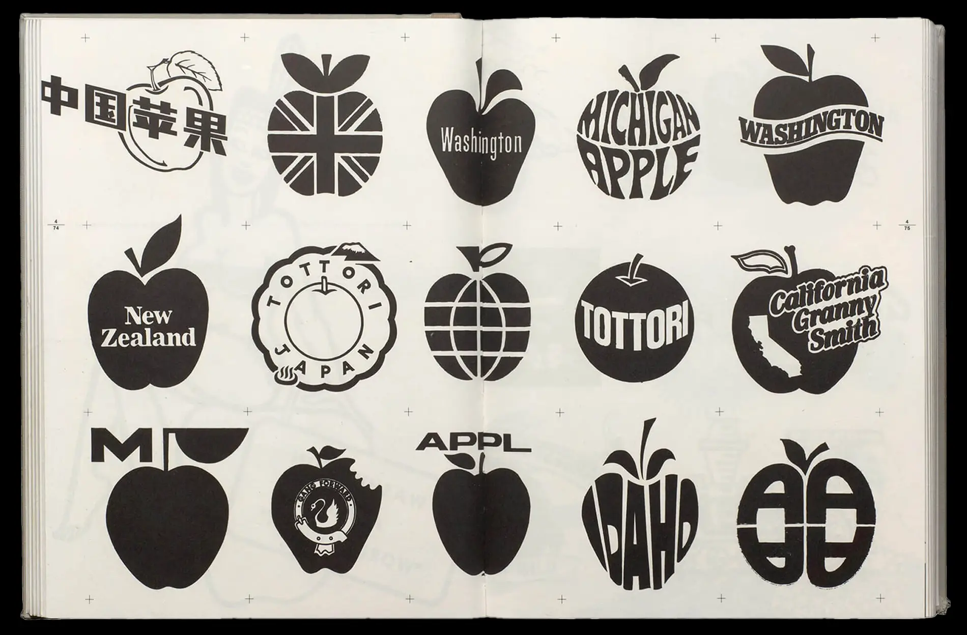
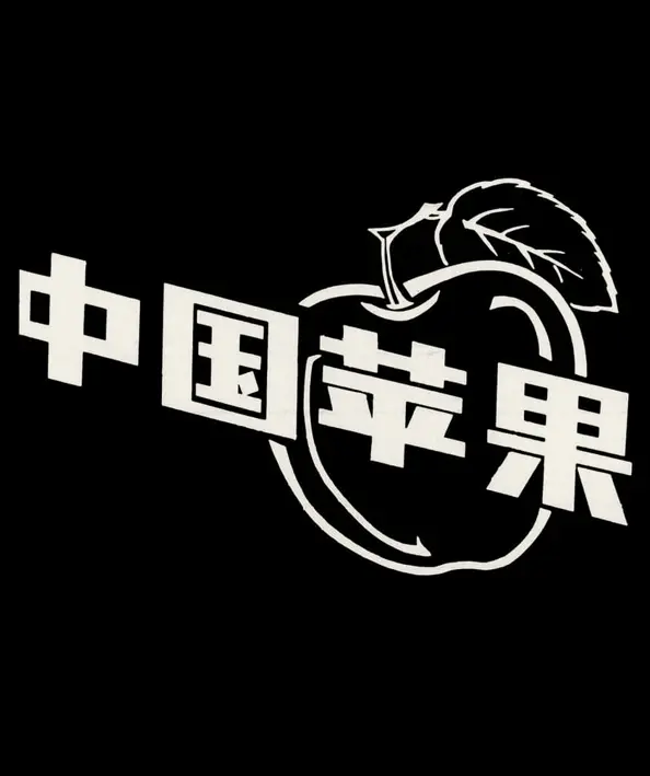
The idea for Pekura began with a fruit logo found on Chinese transport packaging—its bold,
modular forms stood out immediately. Together with ↗ Ylenia
Freiermuth, we began to explore how these shapes could take on new meaning when reassembled in a system of
our own. The result is a back-slanted, bold typeface that plays with rhythm, repetition, and structure while
keeping a sense of lightness and curiosity.
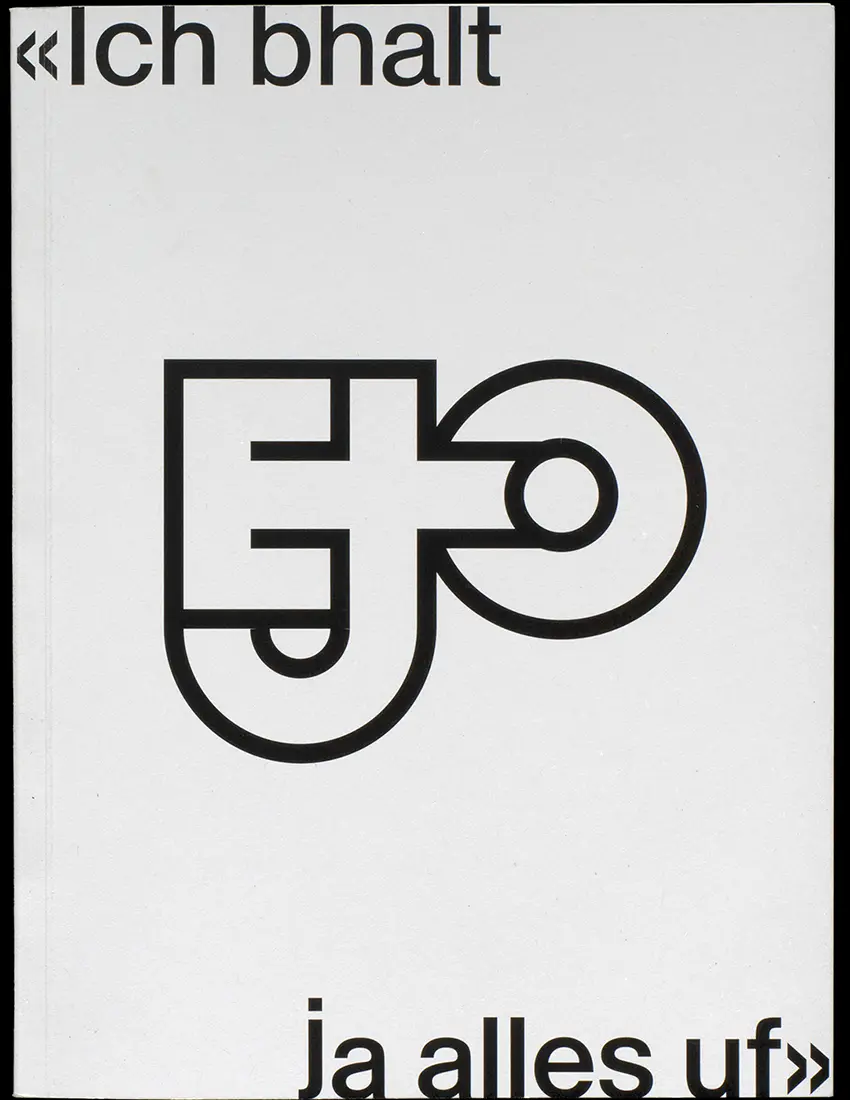
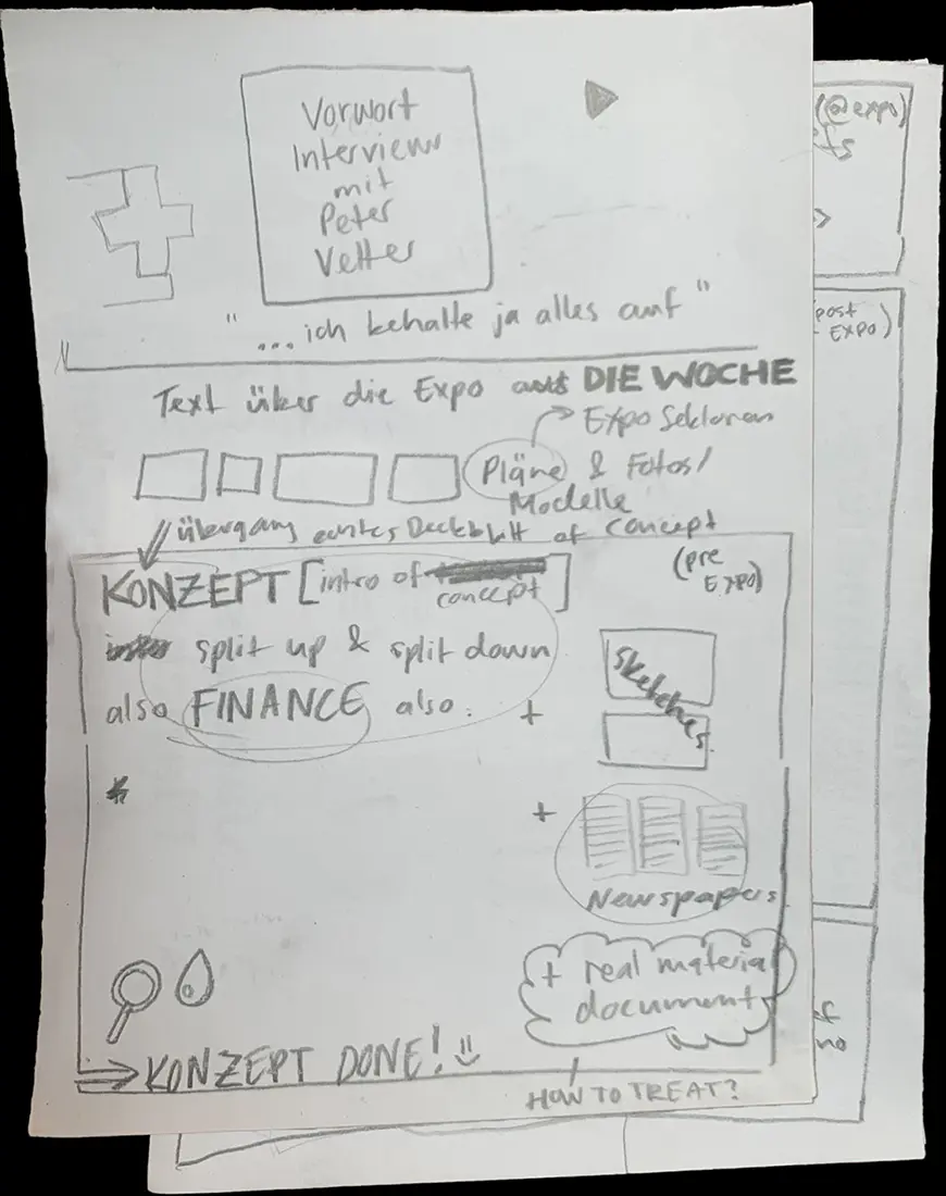
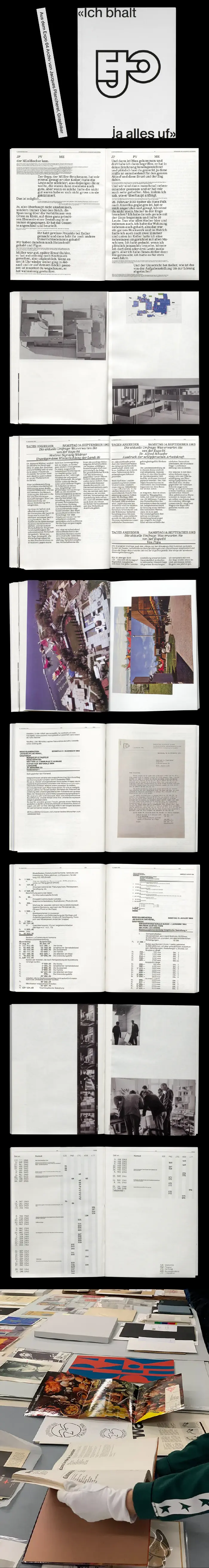
Ich bhalt ja alles uf
Editorial
175×235mm
196p.
196p.
May 2023
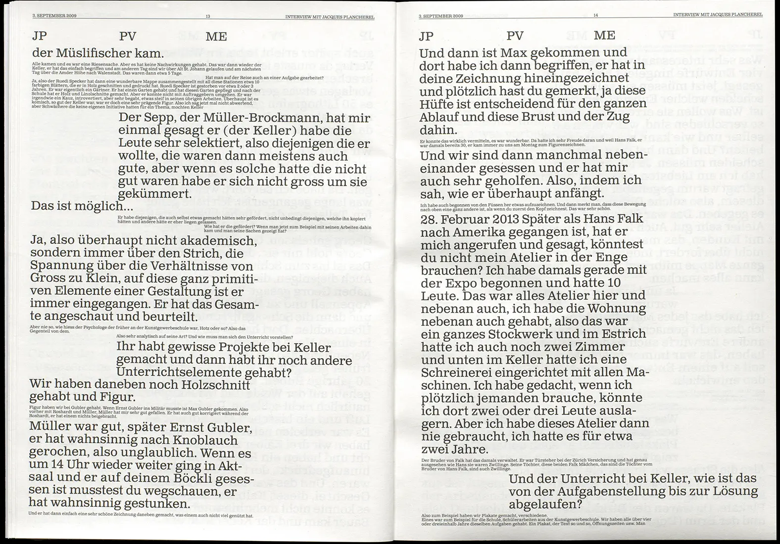
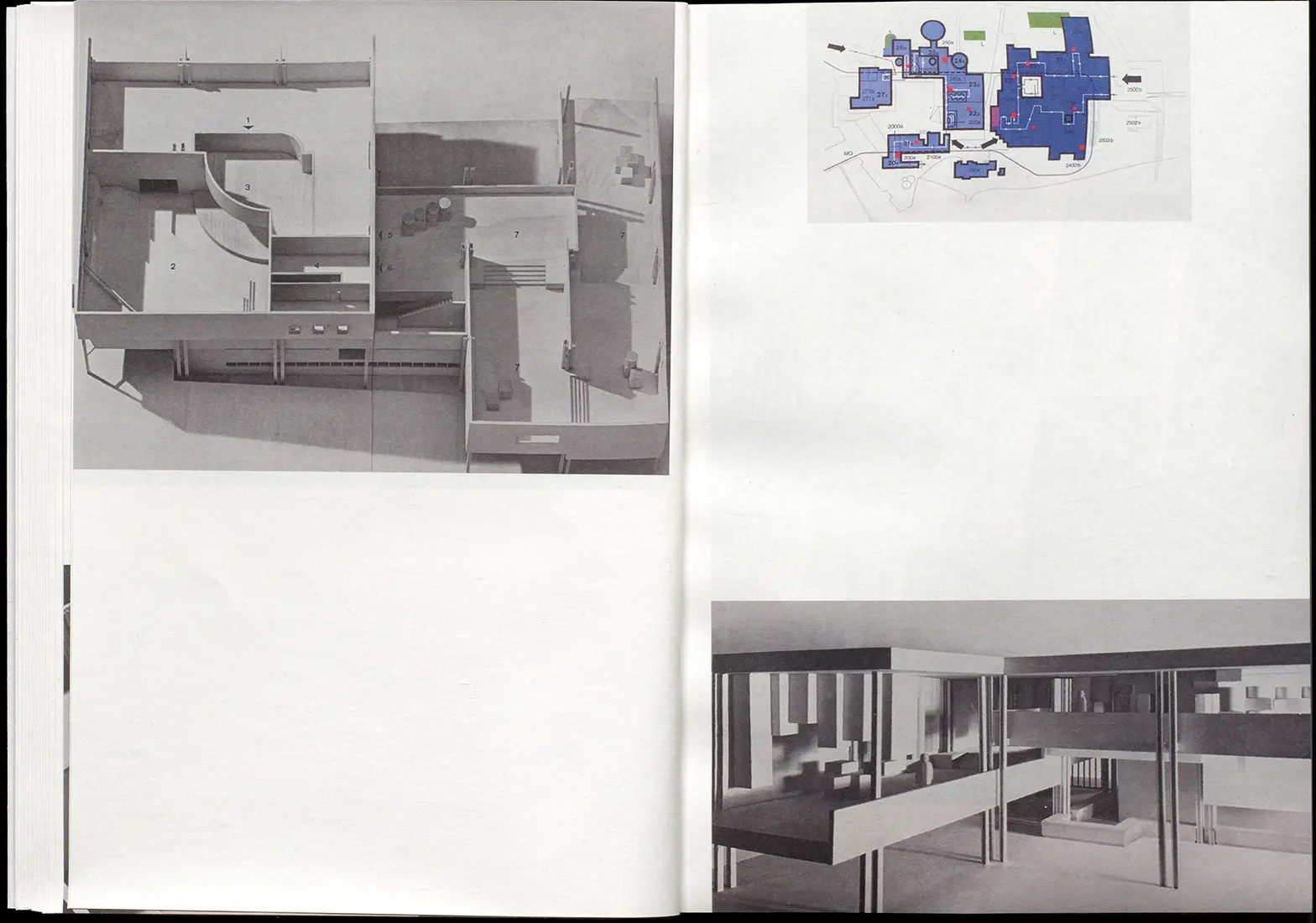
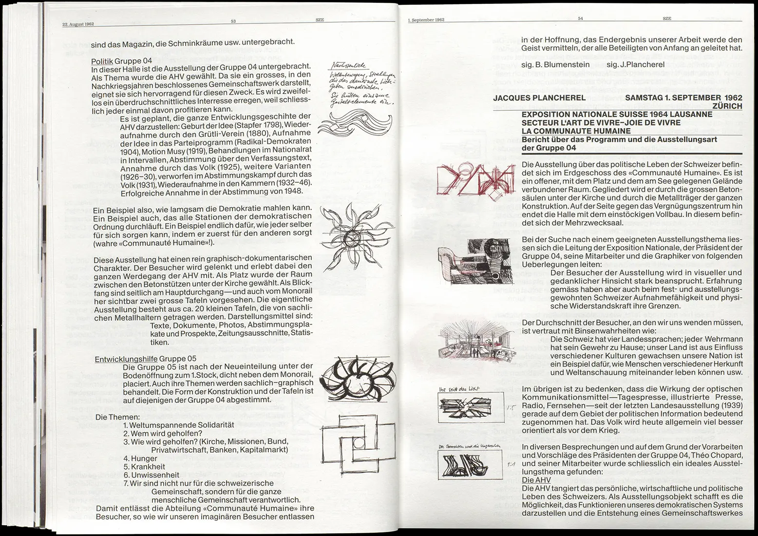
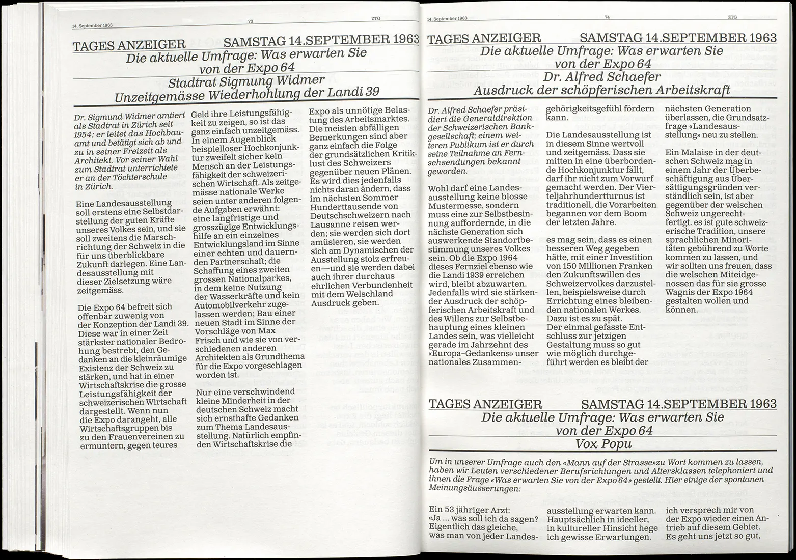
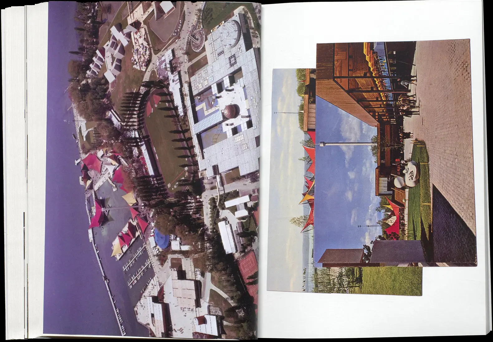
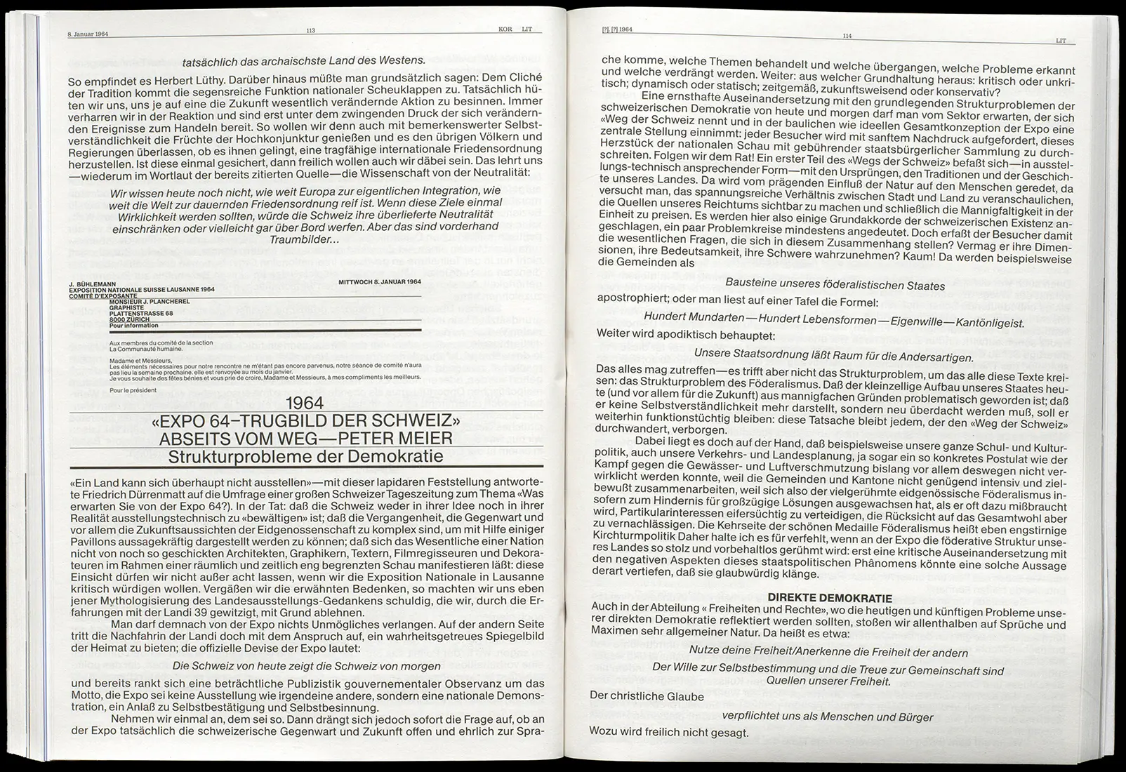
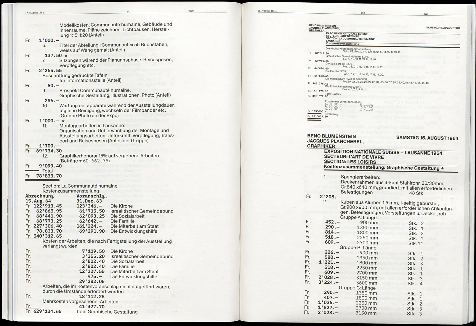
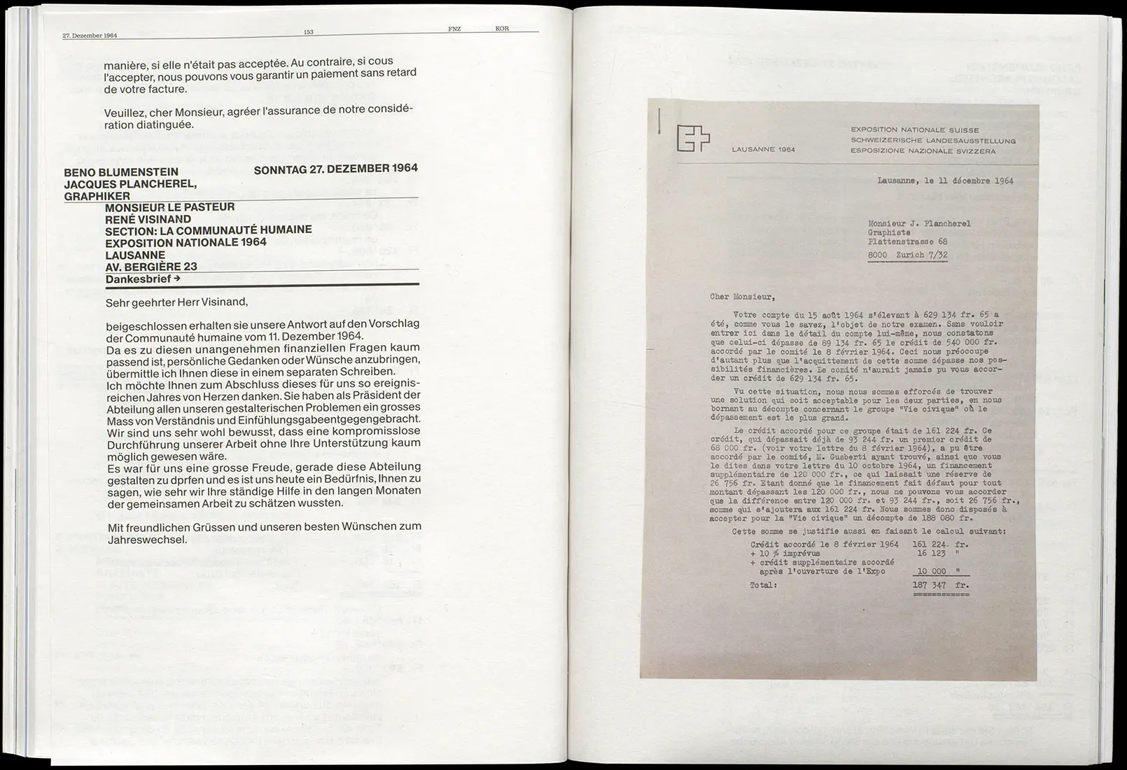
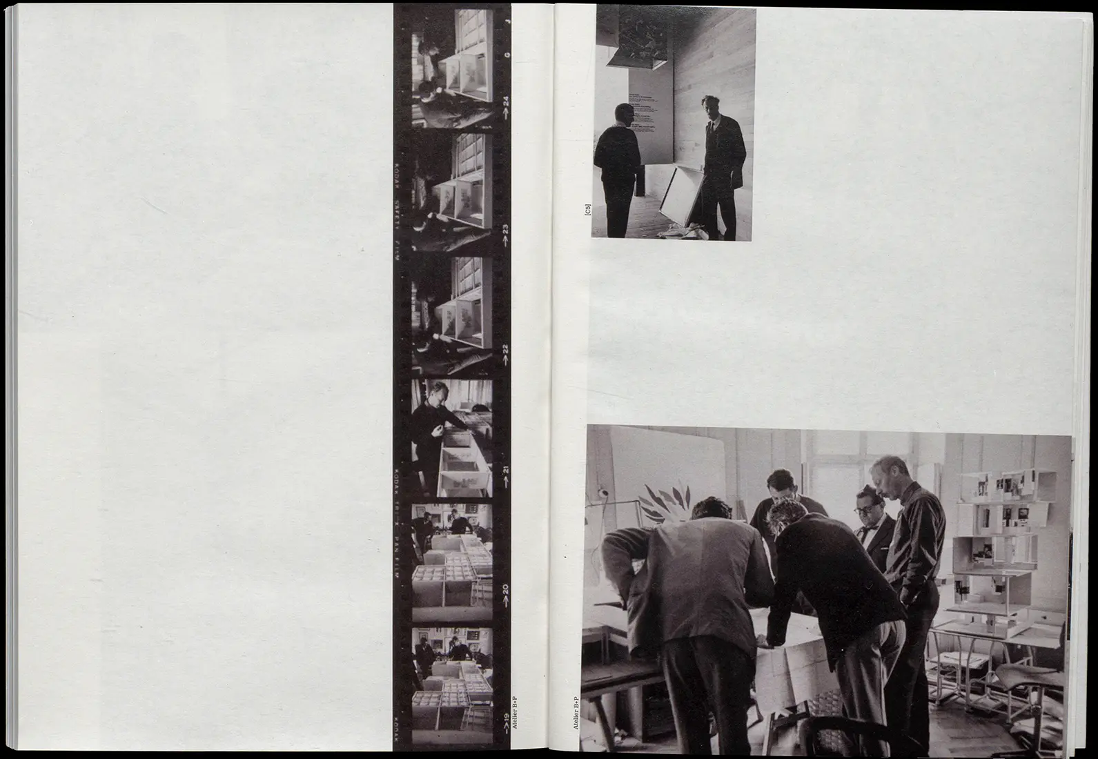
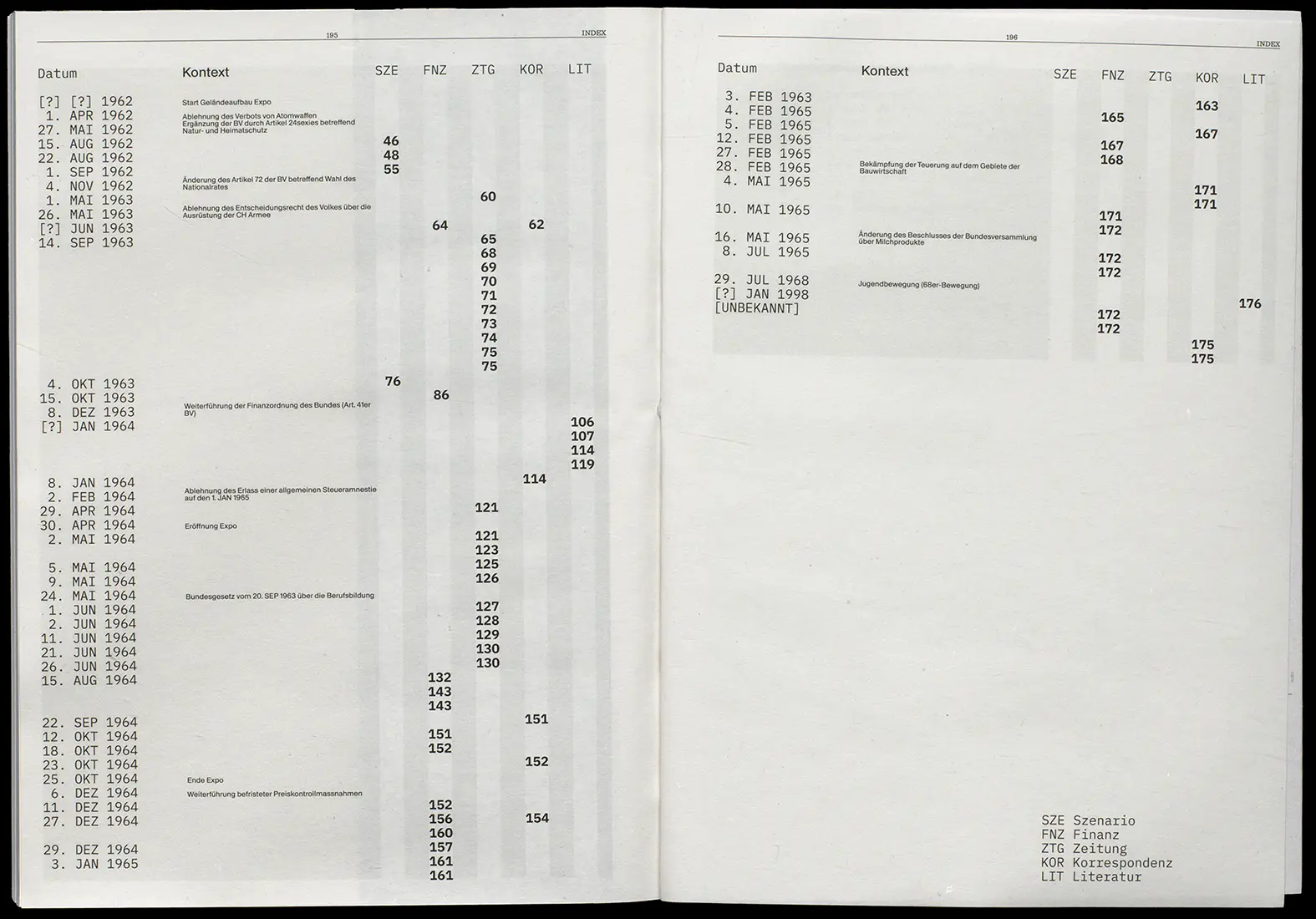
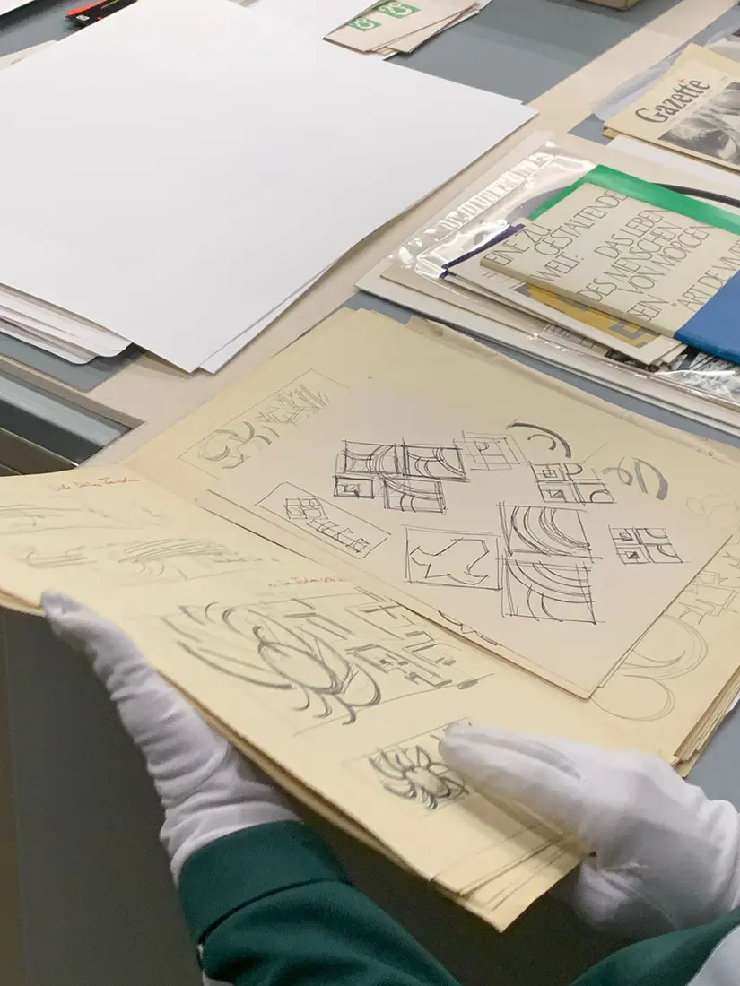
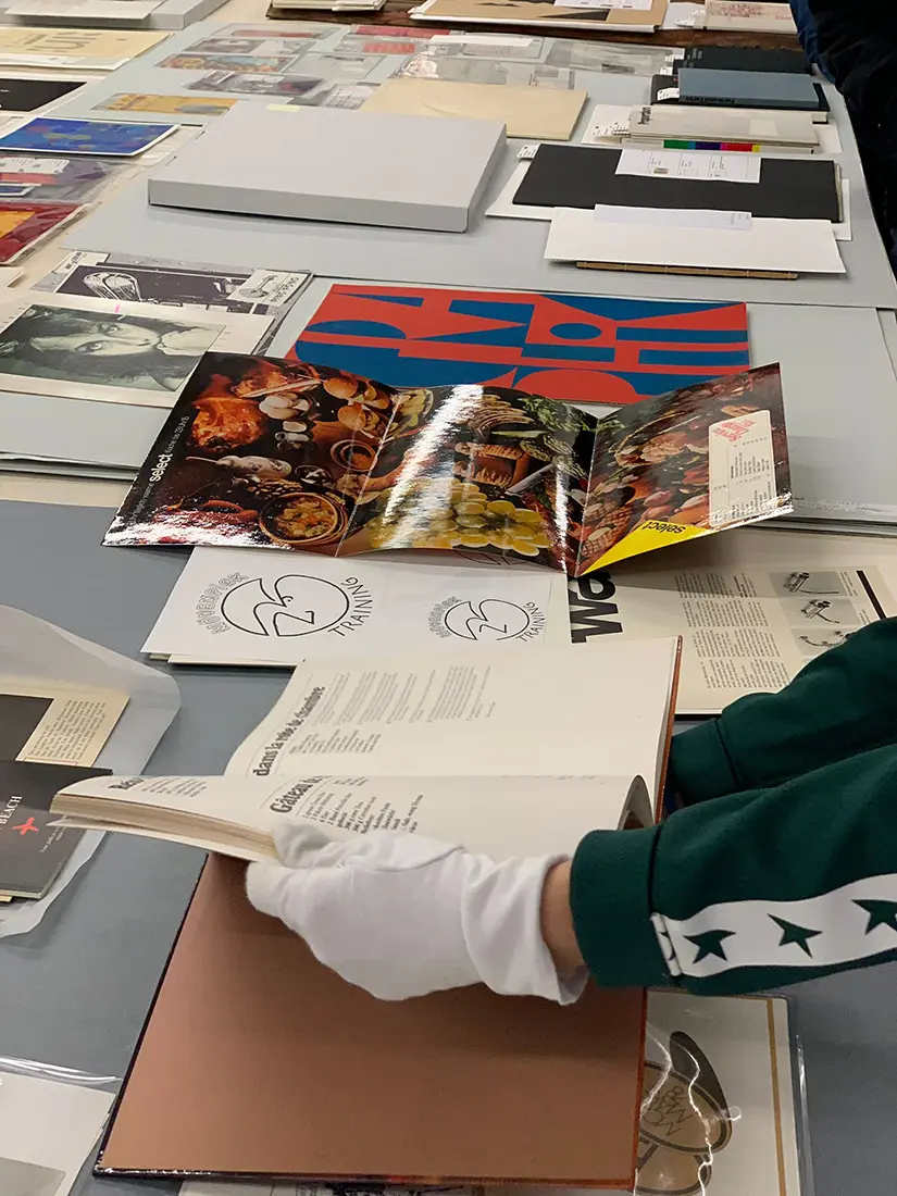
Graphic designer Jacques Plancherel wasn’t exaggerating when he told SRF that he kept everything.
In collaboration with ↗ Artemisia Astolfi,
↗ Anastasiia Maslei and
↗ Sarah Iller, we gained access to the archives of the Museum für
Gestaltung, where we uncovered box after box of material documenting Plancherel’s work on the national exhibition
‘Expo 64’—from financial and scenario reports to public feedback. This book offers a rare glimpse into the creative
process and reveals the hidden stories buried deep in archives, documents that often never reach the public eye.

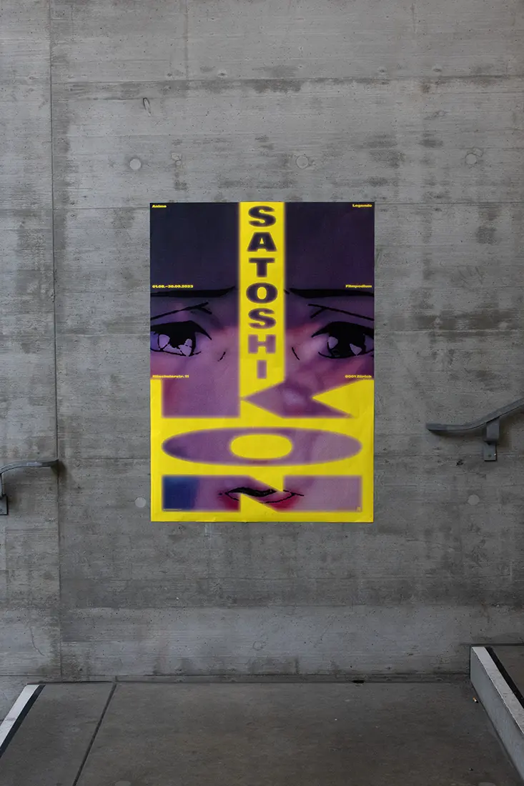
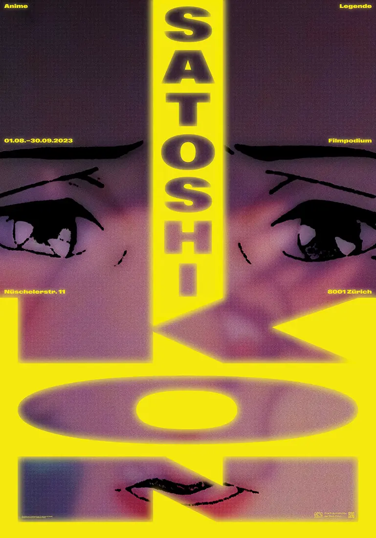
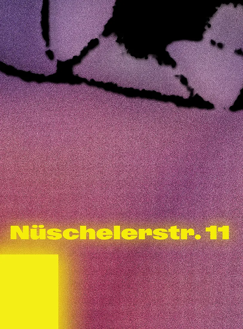
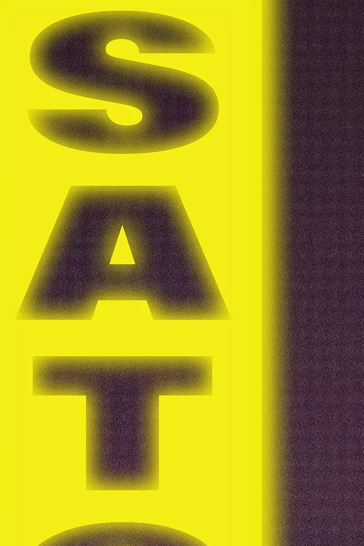
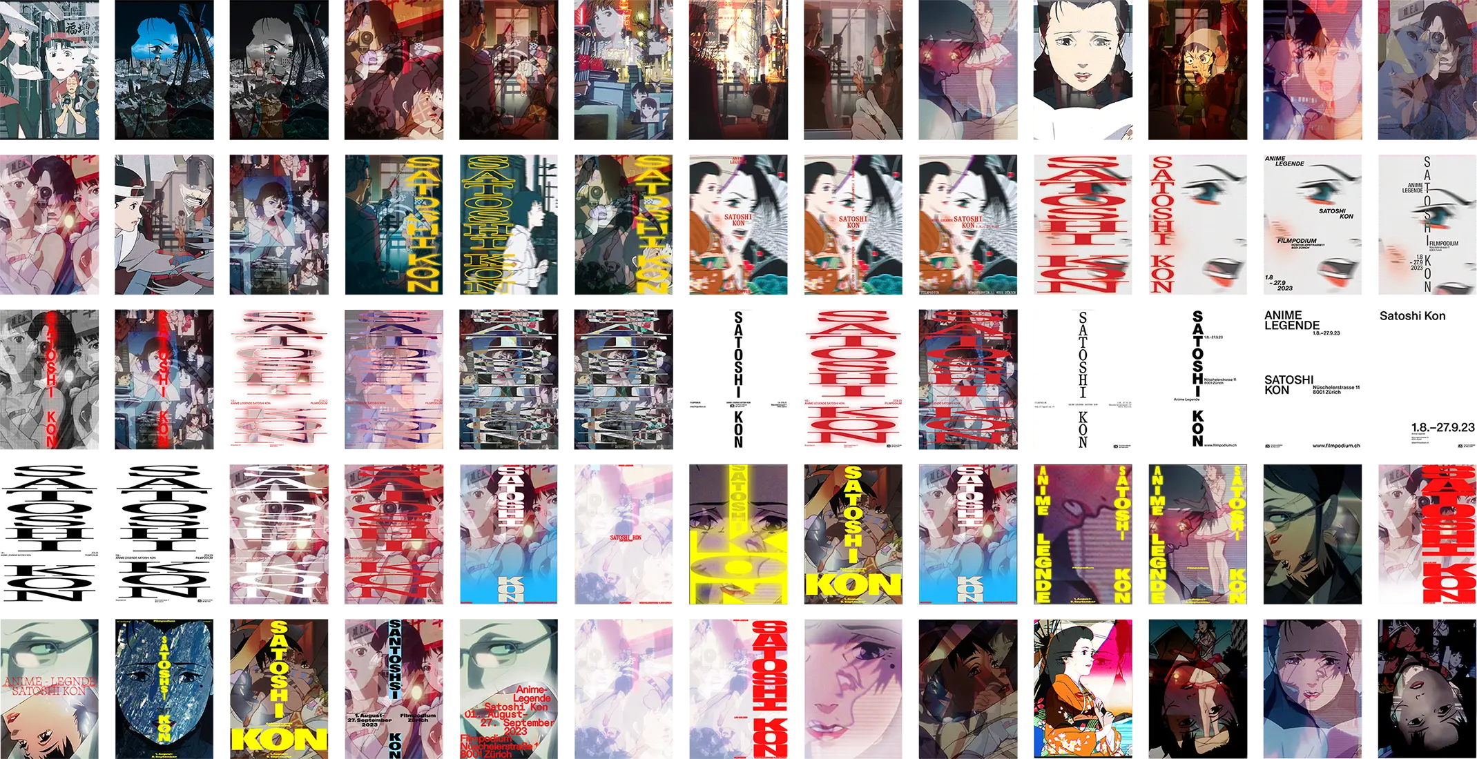
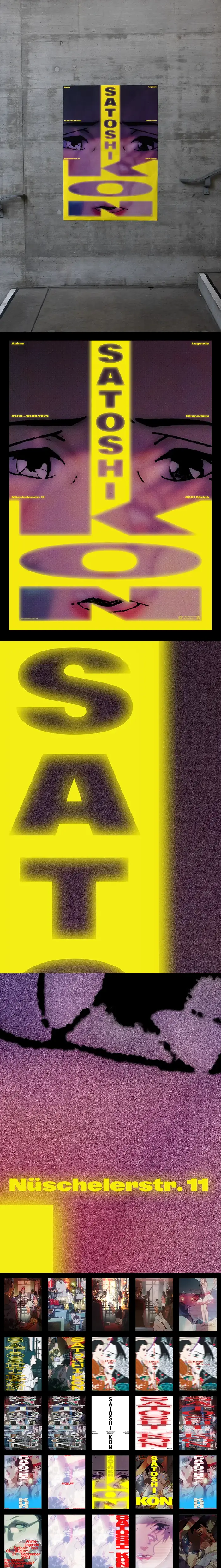
Satoshi Kon
Poster
[shortlisted]
[shortlisted]
F4
June 2023
Known for films like Perfect Blue and Paprika, Satoshi Kon left a lasting mark on animation
with his dreamlike storytelling. In collaboration with ↗ Sarah Halbgewachs, this poster project explores how his themes
of blurred realities can be translated visually. Using layered images, we echoed his shifting perspectives, while the
bold vertical typeface—drawn from the energy of Japan’s city streets—adds a deliberate tension to the softness of the
imagery. The poster was shortlisted for the ↗ Filmpodium.
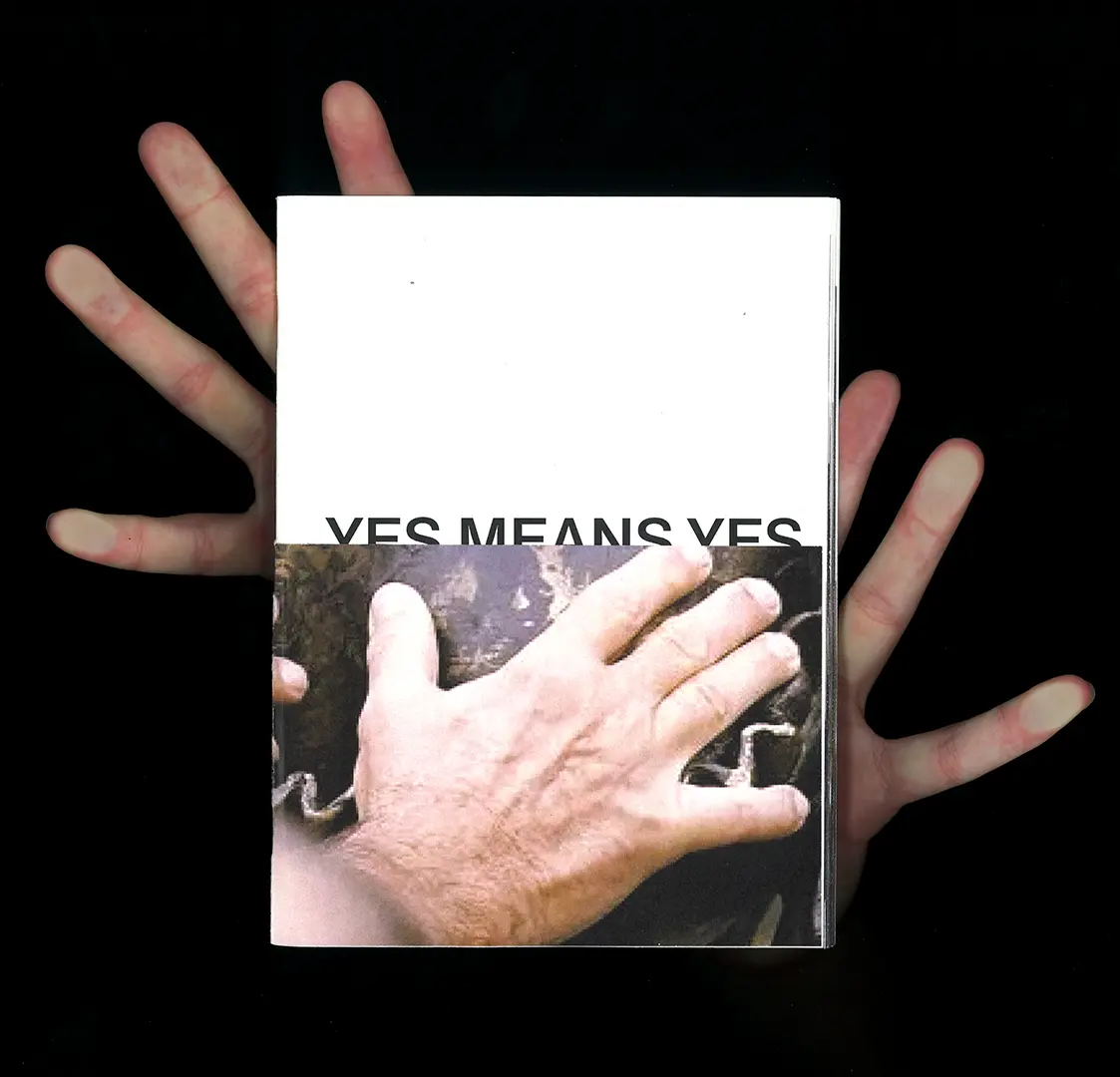
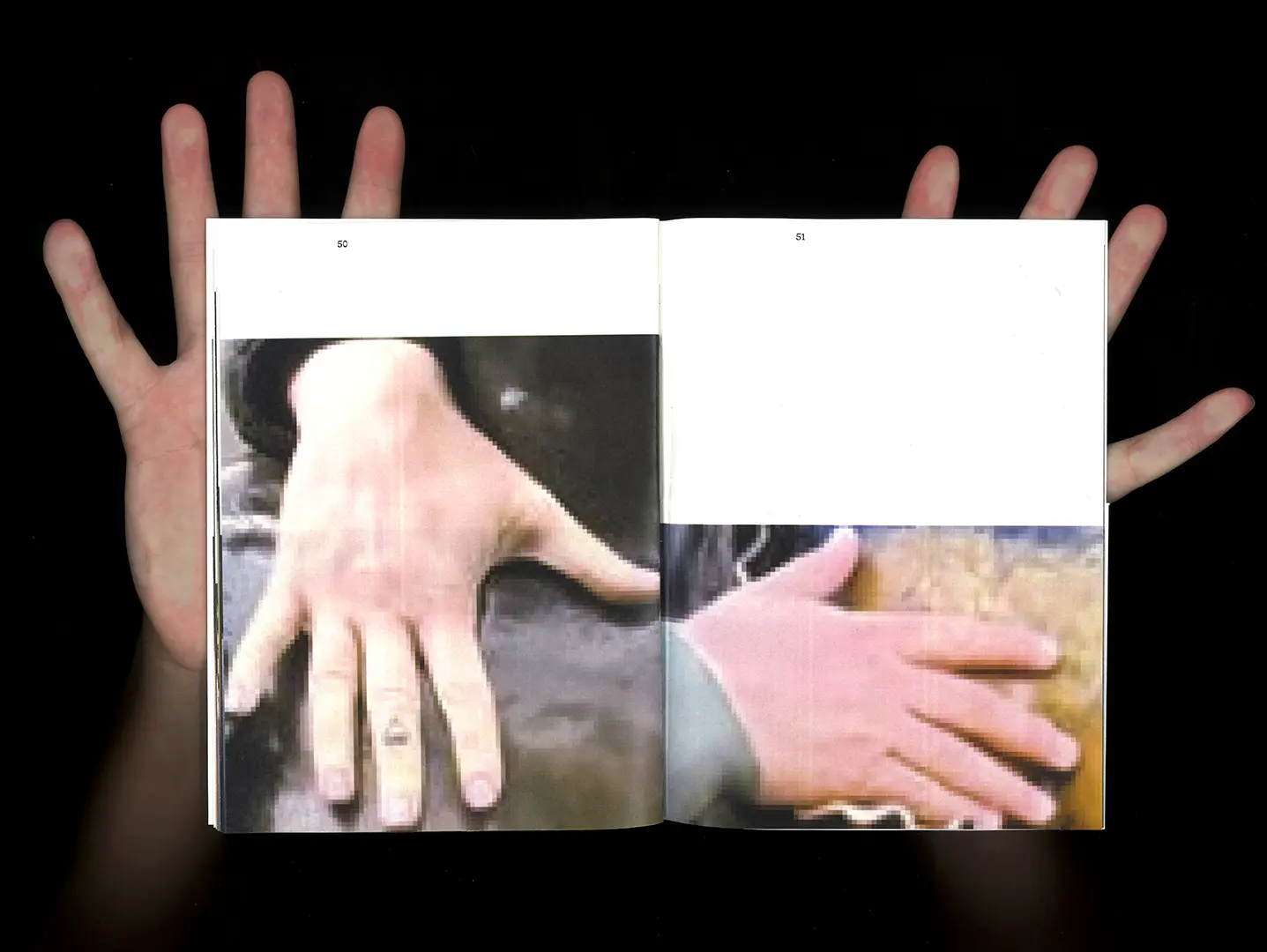
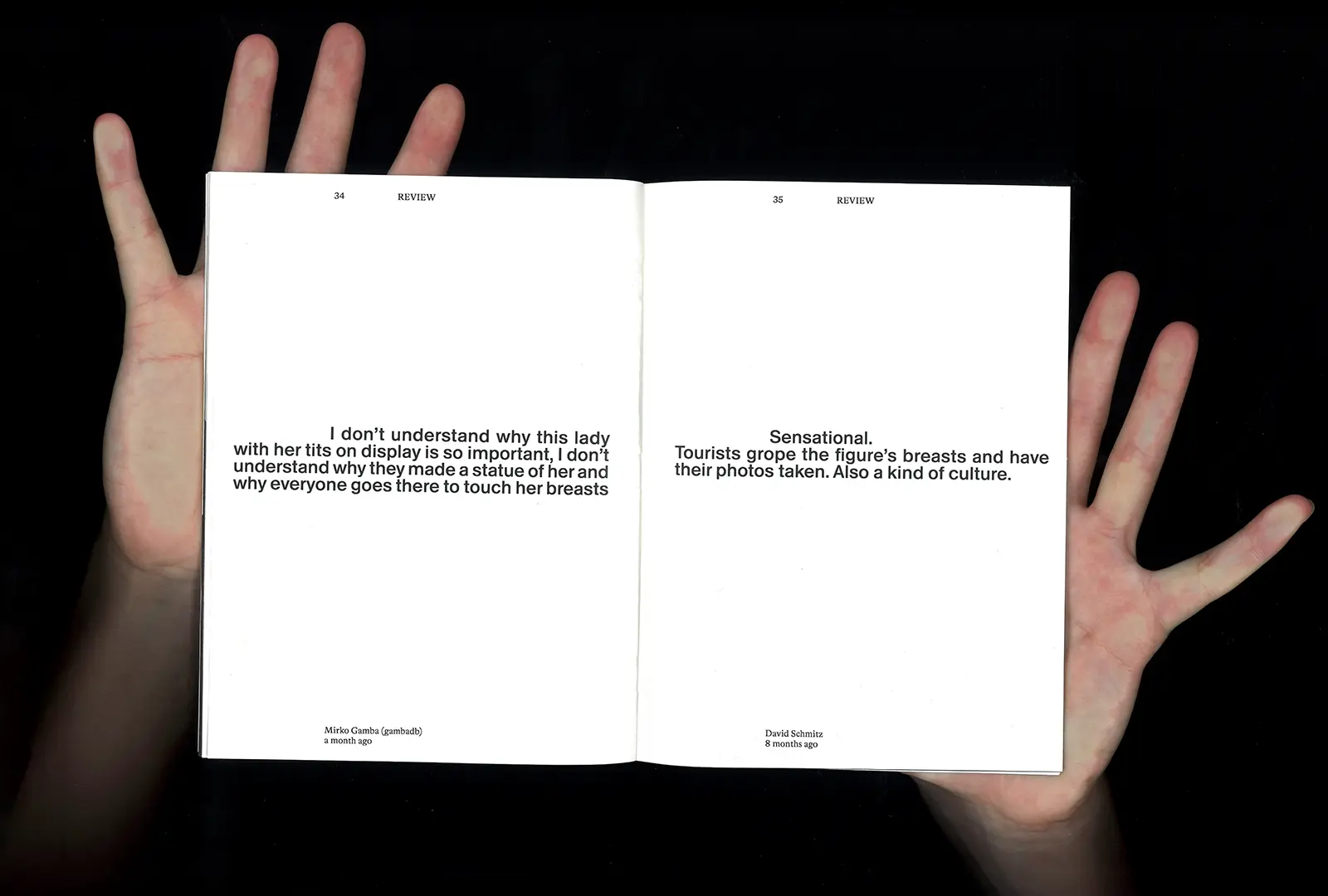
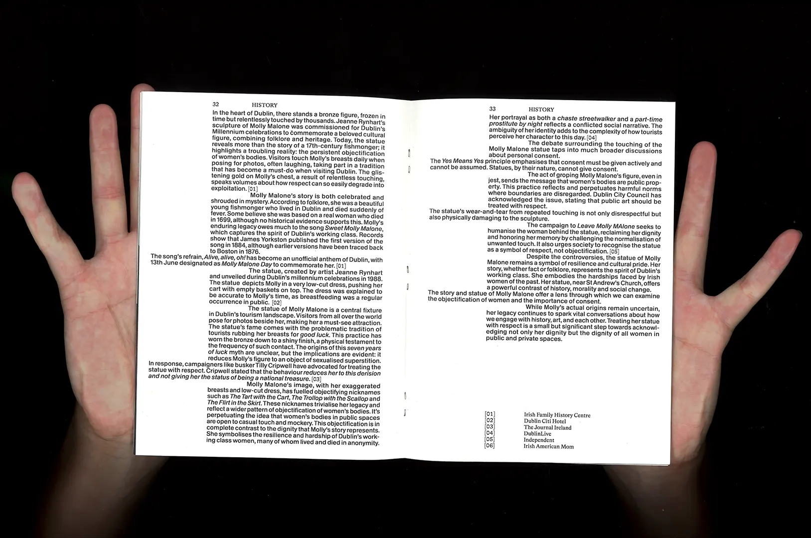
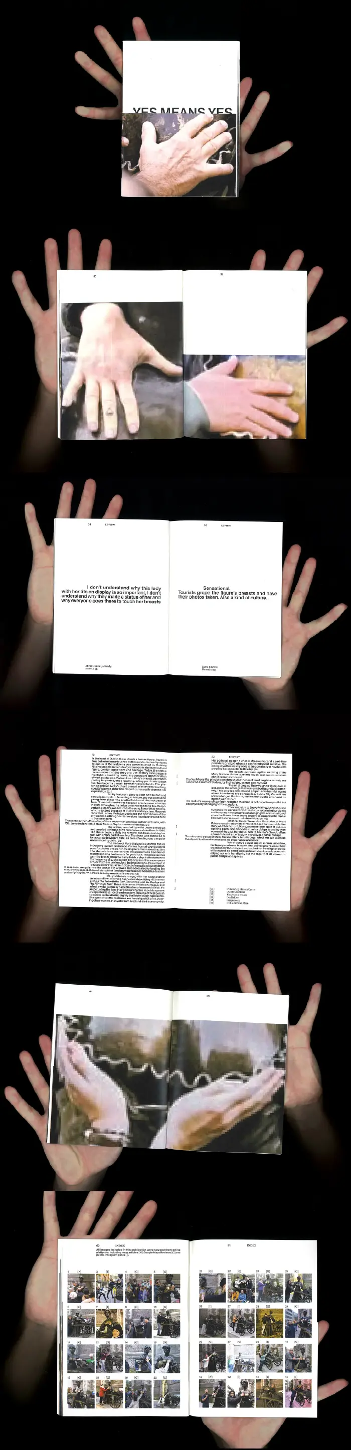
Yes means Yes
Editorial
135×185mm
20p.
20p.
December 2024
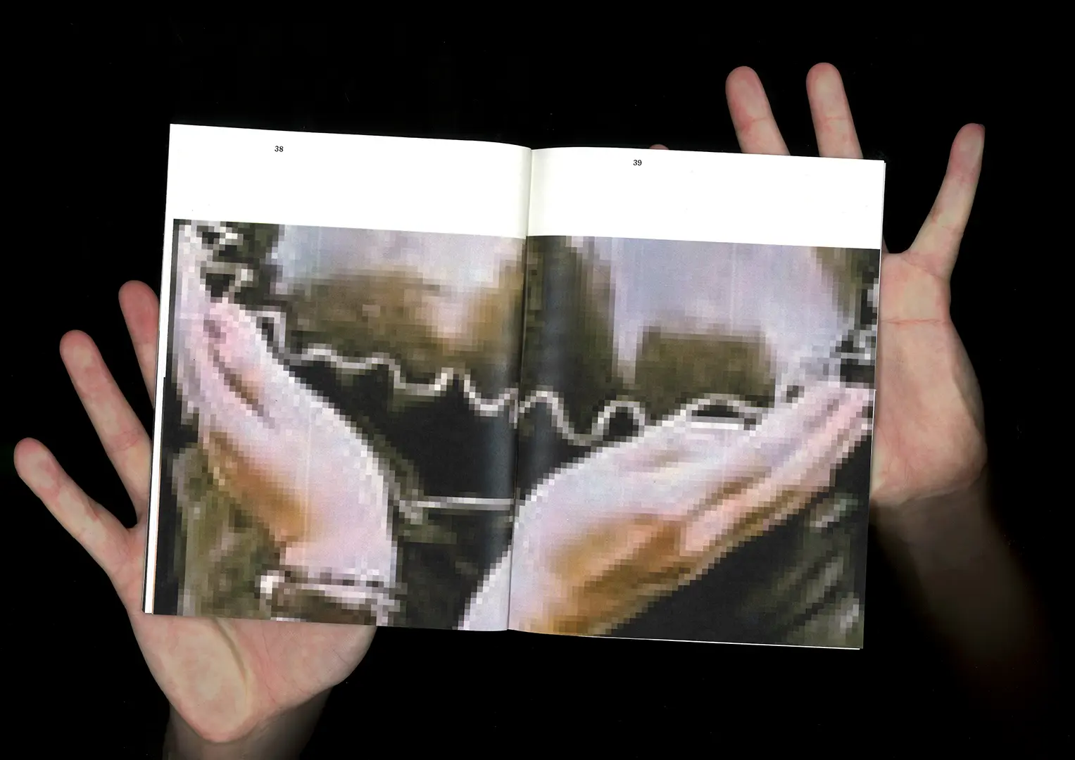
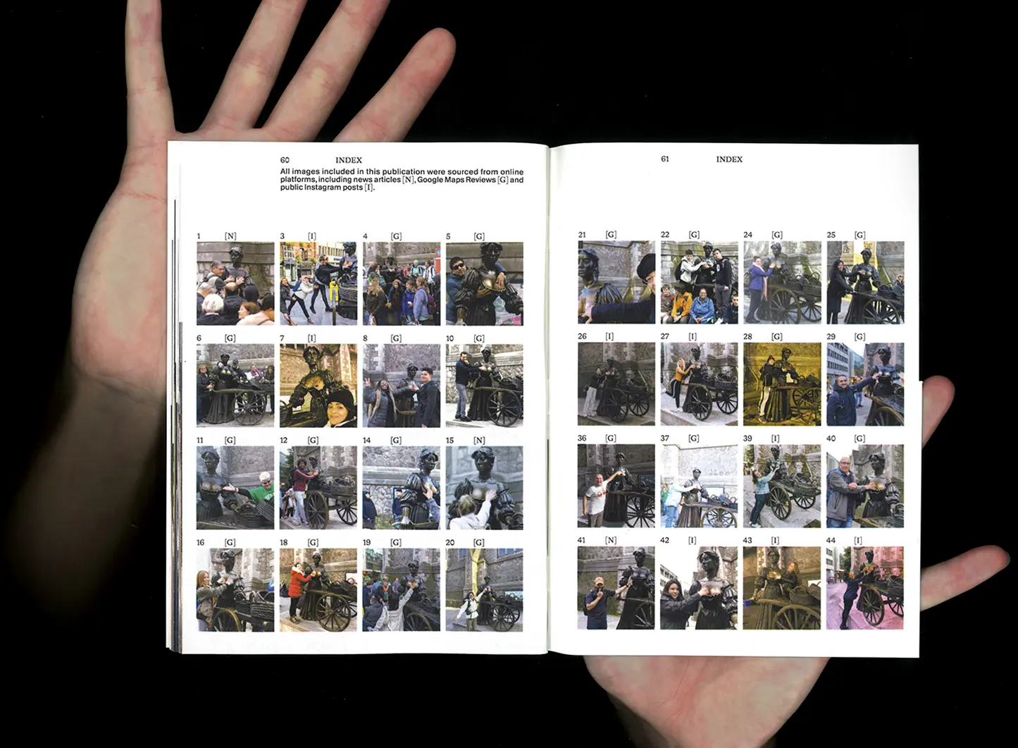
Thousands of hands touch the breasts of the statue of Molly Malone in Dublin
daily, rubbing her breasts until they are golden. Her statue was meant to honour the spirit of 17th
century women workers, but has become a symbol of objectification.
Yes Means Yes stresses that consent must be actively given, never assumed. This publication captures a sample of the thousands of hands that touch her every day. It's time for society to rethink how we treat public art and women's bodies in public and private spaces.
Yes Means Yes stresses that consent must be actively given, never assumed. This publication captures a sample of the thousands of hands that touch her every day. It's time for society to rethink how we treat public art and women's bodies in public and private spaces.
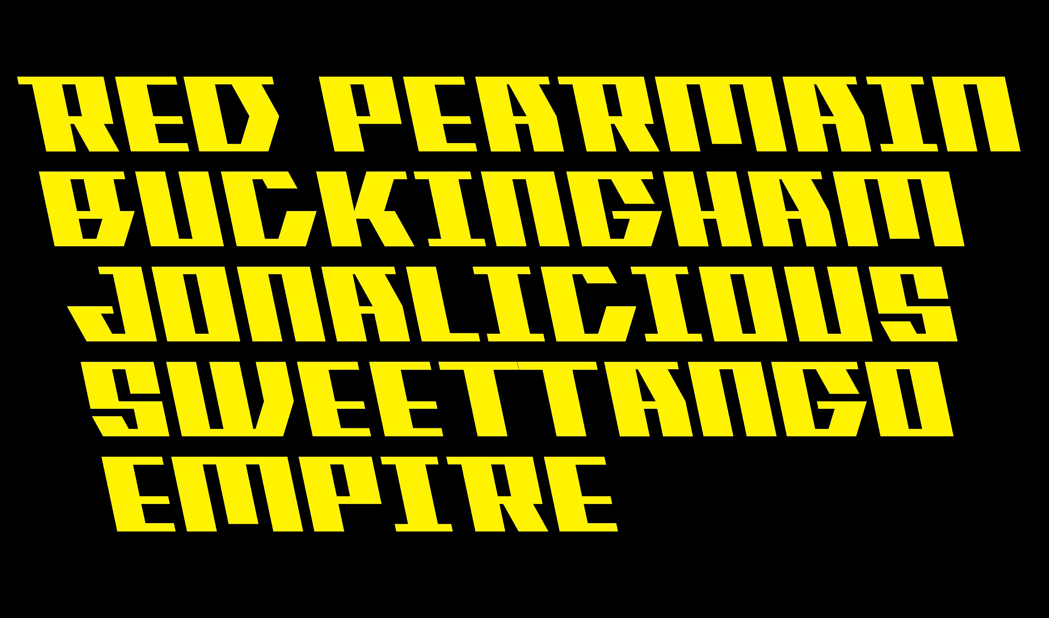
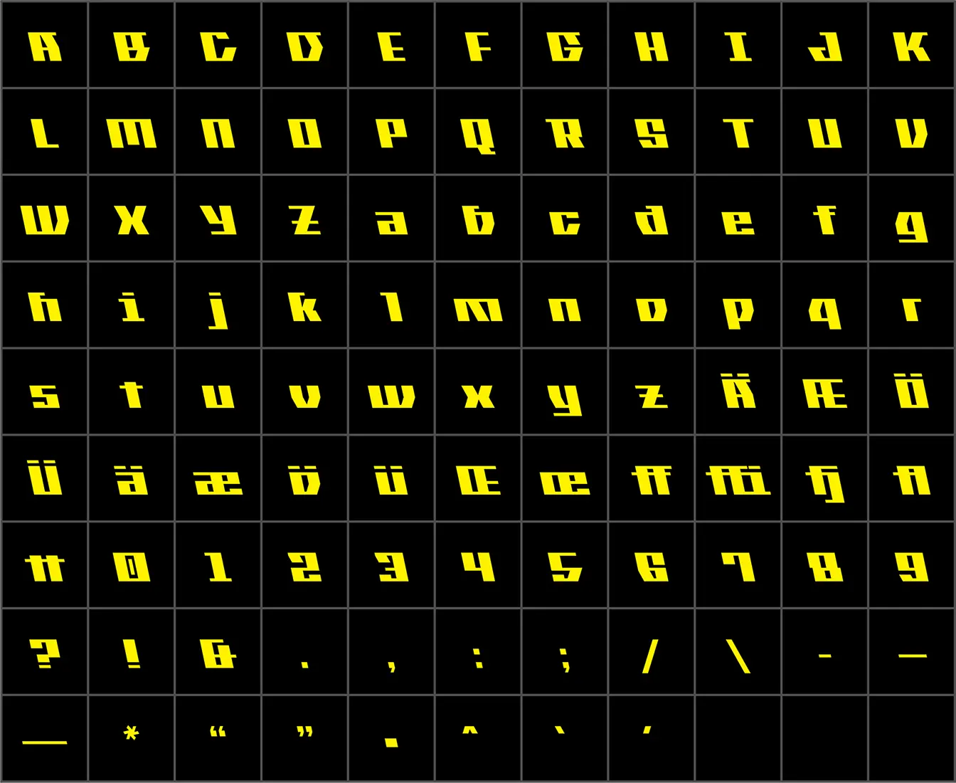
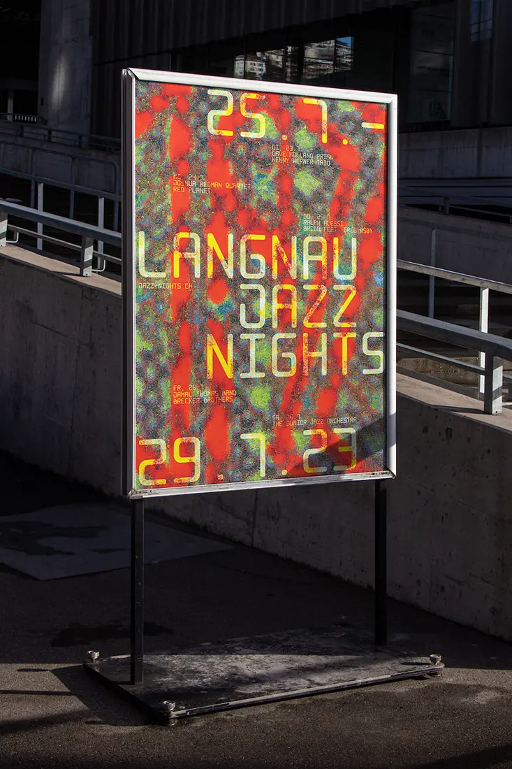
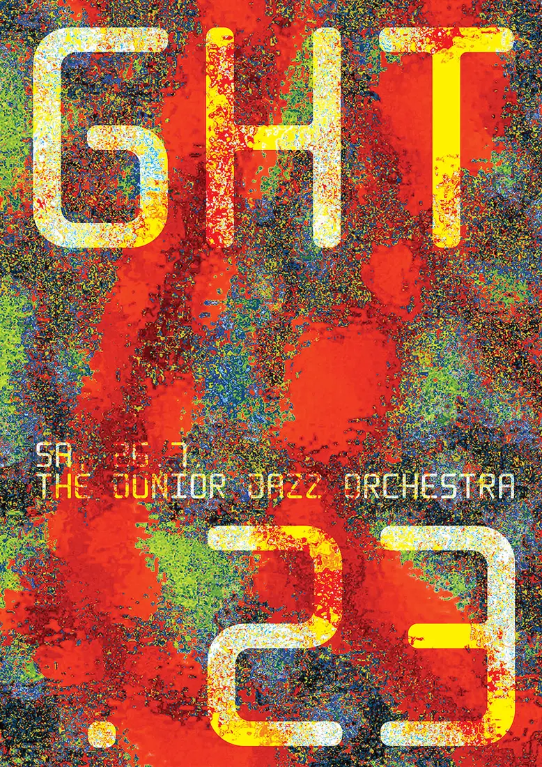
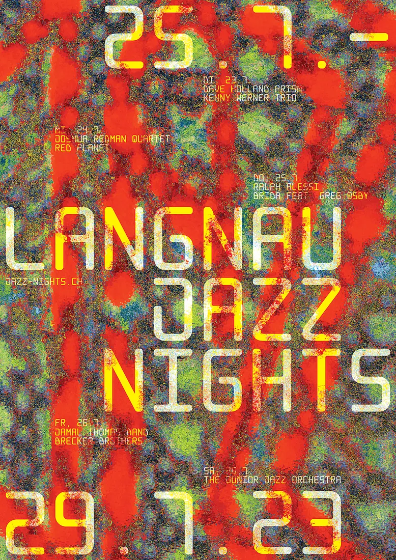
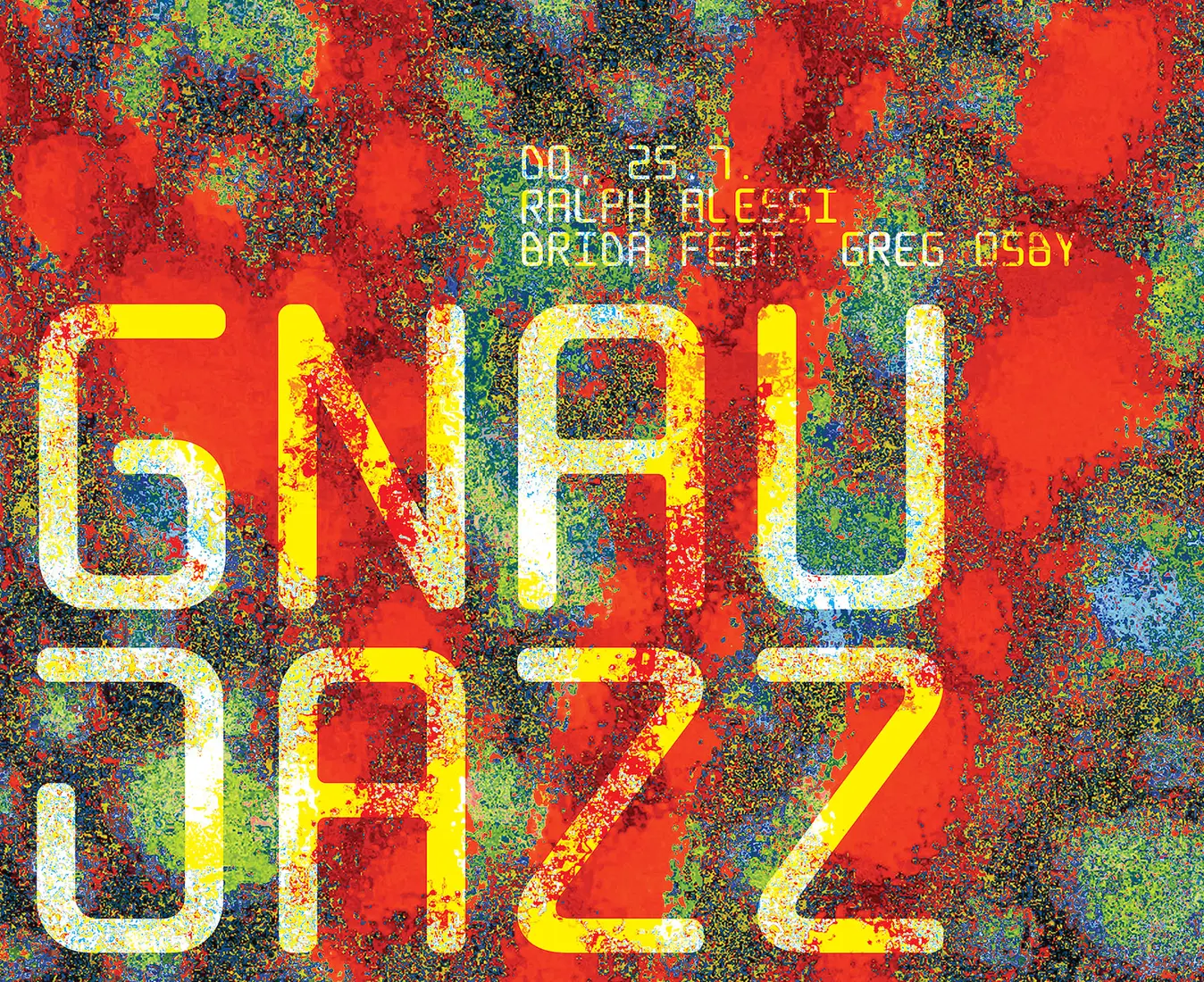
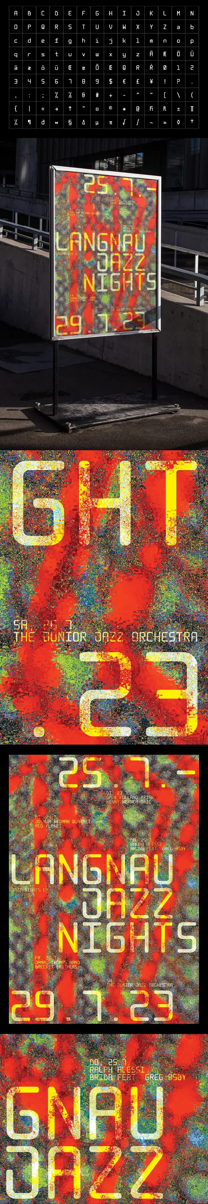
Langnau Mono
Typedesign
Poster
Poster
1000 units
F4
F4
November 2022
Created specifically for the poster proposal for Langnau Jazz Nights, an annual jazz festival
in Emmental, Switzerland, Langnau Mono is built on a strict set of design rules. While its rounded shapes give it
softness, the structured forms of the glyphs maintain a sense of rigidity. Within these constraints, a playful
approach guided the creation of several symbols. Used in the poster, the typeface captures the vibration of
music—never still, always evolving. It interacts with the background in a dynamic way, much like how jazz takes
listeners on a journey through rhythm and movement.
/ Code: Clara Holmes / All rights reserved